We’ve already demonstrated how to maintain a fresh and functional website. Now, let’s explore some examples of creative maintenance pages!
A maintenance page is often the first thing users see when something goes wrong. If it’s vague, broken, or overly clever, trust drops fast. If it’s clear and calm, downtime feels shorter, even when it isn’t.
We reviewed real maintenance pages from SaaS teams, ecommerce sites, and infrastructure providers. The examples below show what works in practice: plain language, clear status, realistic timelines, and guidance on what users should do next. No fluff, no theatrics.
You’ll see patterns you can reuse immediately, from quick “we’re fixing it” pages to fully branded status experiences. Use them to ship a page that buys you time, reduces support tickets, and keeps users informed while systems recover.
What is a Maintenance Page?
A maintenance page is a temporary placeholder page that visitors encounter when a website is undergoing scheduled maintenance or updates.
Unlike a plain error page, a well-designed maintenance page informs users that the site will be back online shortly.
It should provide relevant information in plain language, such as the approximate period of the website outage, and potentially offer status updates via social media accounts.
Why Are Maintenance Pages Important?
No one likes having to shut down for any length of time, but as we know, updates and overhauls must happen occasionally.
If you’re thinking of neglecting to make any kind of maintenance page, these factors might change your mind:
Keeping users informed
A maintenance page is a brand’s way of saying, ‘We’re busy pushing improvements to give you a flawless user experience.’ It’s crucial for keeping both regular users and potential customers updated.
Maintaining brand image
A creative maintenance page that aligns with the brand’s style guide, color scheme and voice and stays consistent with other branded assets such as social media graphics, email signatures, and digital business cards, ensures that even in maintenance mode, the brand image remains strong and coherent.
Avoiding broken links and errors
During website maintenance, various site elements may be non-functional.
A simple website maintenance page prevents visitors from encountering broken links and errors during this time, preserving the site’s integrity.
Redirecting traffic
Maintenance pages can guide visitors to other useful areas of the online service, like a blog post or social media page, thus retaining visitor engagement even when the site is offline.
Taking your site offline for maintenance is a small trade-off for the long-term functionality and health of a website.
Prioritizing a site running smoothly greatly benefits website visitors by offering them a seamless experience.
When updates loom, bear in mind the significance of an effective maintenance page – it acts as a bridge of communication and showcases your brand’s dedication to its visitors.
What a maintenance page should tell users (and what it should avoid)
A maintenance page is a status message, not a marketing asset. When users land on it, their job is simple: understand what is happening, how long it might last, and what to do next. Anything that slows that down adds friction.
Start with clarity. Say the site is down for maintenance in plain language. Avoid jokes, clever headlines, or vague phrasing. Users should not guess whether the issue is planned work, an outage, or their own connection.
Time context comes next. If you know the window, share it. Even a rough estimate like “back within one hour” is better than nothing. If timing is uncertain, say that directly and explain when the page will be updated. Silence creates more frustration than a delayed fix.
Status matters more than apologies. A short explanation of what type of work is happening helps users trust the message. Examples include database upgrades, infrastructure changes, or scheduled deploys. Keep it high-level and skip internal details.
Give users an option. If there is an alternative URL, a read-only mode, or cached content, link to it. If not, point them to a status page or social channel where updates appear. This reduces reload spam and support tickets.
Avoid these common mistakes:
-
No update path, users refresh endlessly
-
Fake progress bars or countdowns that reset
-
Long brand stories that bury the message
-
Contact forms that route to unavailable systems
Design still matters, just less than content. The page should load fast, work on mobile, and not depend on the systems being maintained. A simple static page often outperforms a dynamic one during outages.
For longer or recurring maintenance, consistency helps. Use the same wording, layout, and update flow each time. Users learn what to expect, which lowers anxiety and confusion during future downtime.
A good maintenance page does not try to impress. It sets expectations, reduces uncertainty, and gets out of the way.
Maintenance Page Best Practices
It’s easy to just slap up a ‘We’ll be back soon!’ page and go about your day, and many brands do exactly that.
But if you want to stand out, properly inform your readers, and make them smile all at the same time, follow these tips to make your maintenance page memorable in a good way.
Clear and informative messaging
A good maintenance page should clearly inform visitors that the site is temporarily unavailable due to maintenance.
It should provide an approximate period for when the site will be back online, using plain language that is easy for anyone to understand.
Consistent brand image
A maintenance page should align with your brand’s color scheme, logo, and overall aesthetic.
This reinforces the brand identity even when the site is offline, making the maintenance screen more than just a temporary placeholder, and reassuring visitors that they’re in the right place.
Engaging visual elements
Creative maintenance page designs, such as incorporating a visually appealing static image or animation, can make the wait more pleasant for visitors. For an even more engaging experience, businesses can use a video maker tool to create short, branded videos that inform visitors about the maintenance process or upcoming updates.
Navigation options
Offering links to other functional parts of your site, such as a blog or social media accounts, allows visitors to stay engaged with the brand while the main site is under maintenance.
Status updates and communication channels
Providing a link to a status page or offering a subscription option for updates (like an email list) keeps users informed about progress. It shows transparency and consideration for the user’s time.
Apology and reassurance
A simple, sincere apology for the inconvenience caused, along with reassurance that the team is working hard to bring the site back, can go a long way in maintaining a positive relationship with visitors.
Custom error handling
In cases of an unexpected website outage, having a custom error page that defaults to the maintenance page design helps to maintain a consistent and professional appearance.
Mobile responsiveness
A good maintenance page must be just as accessible and visually appealing on a smartphone or tablet as it is on a desktop.
While some websites choose generic maintenance pages, there’s room for creative options. Businesses can opt for a UI & UX design agency to create branded, user-friendly maintenance screens that reflect the company’s identity and maintain customer trust.
Explore various variations that can engage visitors during prolonged maintenance.
Your maintenance page is more than a placeholder — it showcases dedication to user experience, brand consistency, and communication.
Use downtime as a chance to leave a positive impression on your audience.
9 Creative Maintenance Page Examples
1. Reddit Maintenance Page
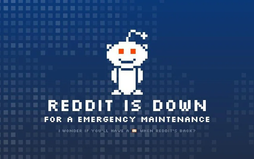
What we like: Reddit’s infamous mascot, Snoo, is shown, we’re clearly informed about the issue, and there’s a little message encouraging visitors to come back and check for messages.
What we don’t: The grammar is a little off here (no ‘a’ should be used), and there’s no expected return time. For many Redditors who need their fix, this is a no-no.
In Reddit’s defense, this page has been out of use for many years, as Reddit users were quick to jump on the bad grammar. Other iterations of this page have featured YouTube videos, a ‘refresh page’ counter, and other tongue-in-cheek comments that Reddit is known for.
2. LinkedIn Maintenance Page
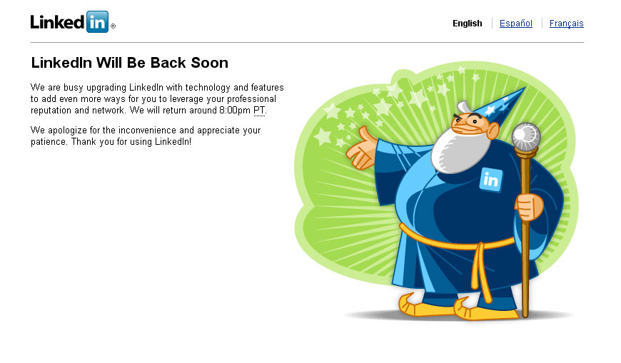
What we like: There’s a set time for when maintenance will be completed, and this page clearly tells readers the reason behind the downtime. Additionally, the language used is consistent with LinkedIn’s brand of professionalism and decorum.
What we don’t: The white space under the text could be better utilized with other reading material, like reading material or a sign-up page. Also, while the text is consistent with LinkedIn’s brand, the LinkedIn Wizard seems a bit out of place here.
The LinkedIn Wizard seems to be a relic of the past, and even though he is cute and precious, their brand is likely better off incorporating a sleeker, more professional design.
3. Flickr Maintenance Page
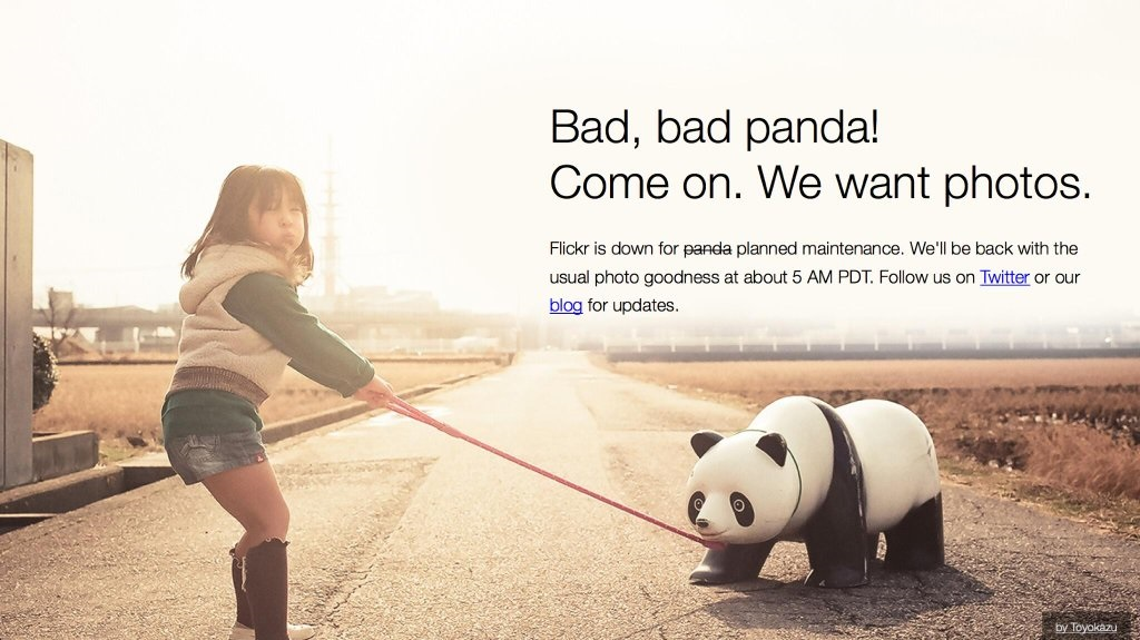
What we like: Firstly, who doesn’t love pandas? We also like that there is an expected end time, and other links to follow to stay on Flickr’s socials or blog. The image itself is also high quality, with the natural white space being perfectly used for the maintenance message.
What we don’t: Besides not picturing a real panda, this is a great page all around.
Flickr, a photograph management and sharing site, perfectly captures its overall brand and personality with this maintenance page. Between the image itself, the links to other Flickr resources, and the estimated return time, this page should serve as inspiration to other maintenance pages.
4. Product Hunt Maintenance Page
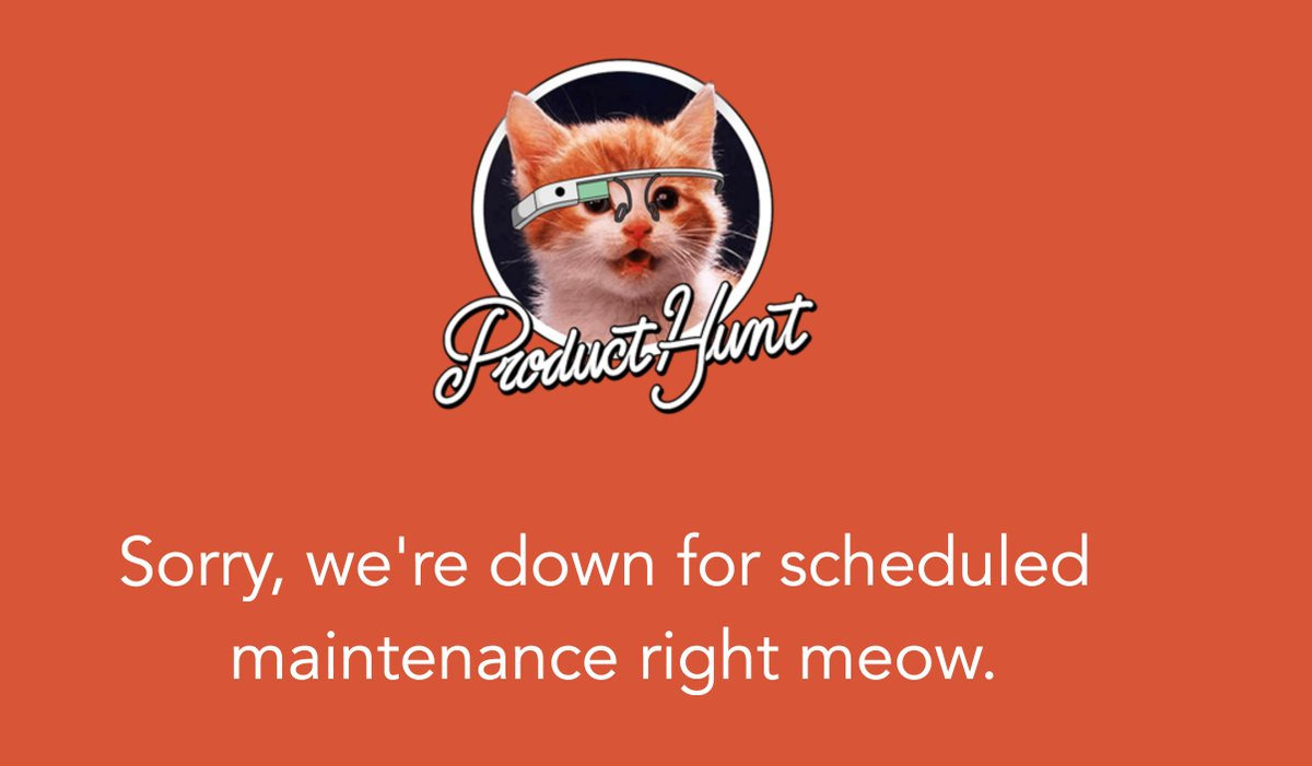
What we like: The branding is clear as this page incorporates ProductHunt’s colors, and there’s a cheeky pun with a nice graphic to go with it. There is also a simple apology, which is nice.
What we don’t: Like with other maintenance page examples, there is no expected return time or other links to check out.
ProductHunt showcases all of the newest and best tech products on the market, so this simple page could be seen as a bit simplistic for such a tech-focused company. But, everyone loves a cute kitten!
5. Atlassian Maintenance Page
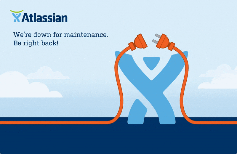
What we like: Atlassian’s page incorporates their logo beautifully and even changes to give their mascot a little shock, which shows great attention to detail.
What we don’t: While the message is simple, readers don’t know what to expect after the update. There is also no expected return time, which could affect users’ work days.
Atlassian, home to task management systems like Jira and Confluence, has millions of users depending on them for their workdays. This page is fun, their clients might be better served with a countdown or a time when the website will be running again.
6. MageComp’s Magneto Maintenance Page Extension
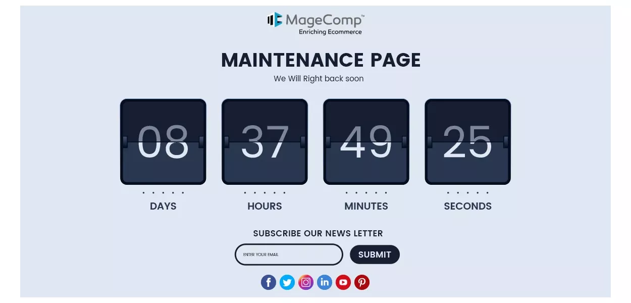
What we like: A bit of a renegade on this list, this extension from MageComp allows you to have a countdown timer on your own maintenance page. You can also link all of your socials as well as get people to subscribe to your newsletter!
What we don’t: The grammar here is a bit off (we will right back soon), and the randomly capitalized words aren’t a great look either. The price of this extension is also on the hefty side at nearly $80.
A countdown is a unique and fun way to let users know when they can come back to your site, but keeping consistent style and correct grammar is vital throughout your entire website.
7. Tumblr Maintenance Page
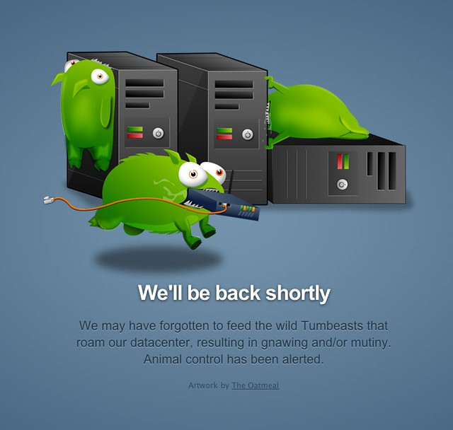
What we like: The Oatmeal creator Matthew Inman is a famous comic artist who has been online since the days of eBaum’s World, and we personally love seeing his work in unexpected places. Aside from that, the text goes well with Tumblr’s brand, and there’s an expectation that the maintenance will be over soon.
What we don’t: There are no other resources to visit or Tumblr-related things to do.
Tumblr is famous for younger folks and artists, so this stylistic choice is a great fit for their company.
8. Interaction Design Foundation Maintenance Page
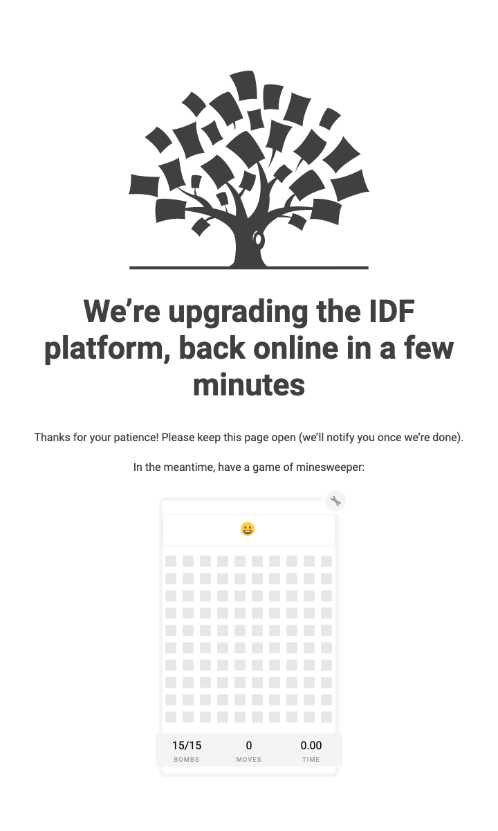
What we like: Having a game on your page is a fun way to entertain visitors and keep them on your page, especially when it’s a nice blast from the past like Minesweeper. This page also gives us a general expectation of when the site will be running again, and lets us know what’s being upgraded.
What we don’t: For a design school, this page seems a bit plain, but it does keep in line with the rest of their pages.
IDF has a very unique take on maintenance page activities, and we love what they’ve done with it. There could be other reading opportunities, or a newsletter sign-up, but Minesweeper makes up for it!
9. StumbleUpon Maintenance Page
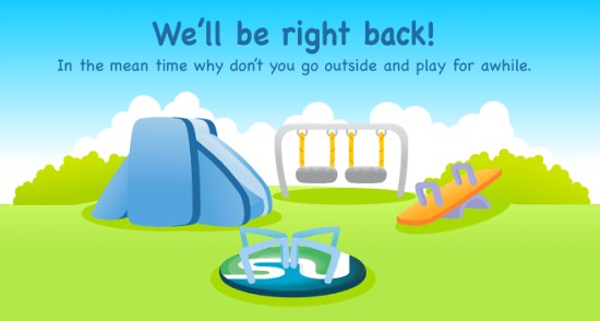
What we like: The encouragement to go outside is nice, even if it does not help their website in any way. Their logo is also cleverly incorporated into the image.
What we don’t: The image itself leaves much to be desired, there is no information about the downtime, and the font and playground make this page seem more directed to children, which one could argue is not who their main target audience is. Grammatically, meantime should be one word.
StumbleUpon is a site where users can discover, or ‘stumble upon’, anything with just the push of a button. Encouraging users to take a break from their screens and go outside is a nice sentiment for a company with such an addictive platform!
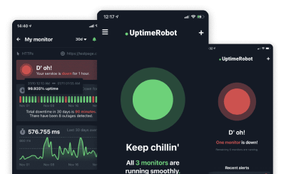
Minimizing Maintenance Interruptions with UptimeRobot
In an ideal digital landscape, maintenance pages are a rarity. UptimeRobot can help make this a reality, actively checking your website’s status at regular intervals and keeping those maintenance pages to a minimum. Here’s how:
Proactive monitoring
After you set up a website monitoring with Uptime Robot sends alerts immediately when your site goes down, allowing for quick action before most users become aware.
Strategic maintenance planning
With Uptime Robot, you can schedule updates during times of low traffic, so more visitors see your live site instead of a maintenance page.
Informative reports
Uptime Robot offers detailed reports that highlight recurring issues, helping to decrease future downtime.
Open communication with visitors
Through Uptime Robot’s API, your site can auto-update status pages, keeping users informed and maintaining trust.
Less downtime equals happier customers, and UptimeRobot acts as your site’s vigilant guardian, striving to ensure that your visitors enjoy a smooth, uninterrupted experience, boosting your brand’s reliability.
Final Thoughts
A maintenance page is far from a mere ‘site-under-construction’ sign, it can serve as a creative canvas.
Crafting a visually appealing, informative, and brand-consistent maintenance page design makes sense, as it keeps your visitors feeling valued and informed during a website outage, rather than left in the dark.
With these planned maintenance pages setting the bar high, the standard for a good maintenance screen is no longer just about going offline responsibly.
It’s about turning a potential pitfall into a unique branding opportunity, a way to solidify the relationship with your visitors while your site gets its quick beauty upgrade to keep running smoothly.
So the next time your favorite site is temporarily down for web maintenance, take a moment to appreciate the creativity and effort behind that maintenance message.
FAQ’s
What is a website maintenance page?
A website maintenance page is a temporary page shown when a site is down for updates, fixes, or infrastructure changes. Its job is to clearly explain what’s happening and set expectations for users. A good maintenance page reduces confusion and support tickets.
What should a good maintenance page include?
A good maintenance page should state that the site is temporarily unavailable, explain why (briefly), and provide an estimated time to resolution if possible. Contact information or a status page link also helps. Avoid vague messages like “down for maintenance” without context.
When should I show a maintenance page instead of a generic error?
You should use a maintenance page when downtime is planned or controlled. Generic errors (like 500 or 503 without messaging) are better suited for unexpected outages. Maintenance pages give users clarity and reassurance during planned work.
How long should a maintenance page be displayed?
A maintenance page should be displayed only for the duration of the planned work. Leaving it up longer than necessary can confuse users and harm trust. Once systems are stable, switch back immediately to the live site.
Can maintenance pages hurt SEO?
Maintenance pages don’t hurt SEO if configured correctly. Use a proper HTTP status code (usually 503) and avoid indexing the page. This signals to search engines that the downtime is temporary.