Status pages shape how users experience downtime. When they’re unclear or outdated, support tickets spike and trust drops fast. When they’re simple and current, users stay informed and patient while systems recover.
This post looks at ten real status page examples from teams that have dealt with outages at scale. Each example highlights what they communicate well, where they set expectations clearly, and how small details reduce confusion during incidents.
You’ll see practical patterns you can reuse, from concise incident updates to timeline clarity and follow-up notes. If you’re building or refining a status page, these examples show what works under pressure.
Status Pages of Global Companies
Take a look at some of our favorite status pages from well-known companies.
1. Apple

What they do: Apple is a household name, a tech titan that has revolutionized the way we interact with technology. Known for its innovative products and services, Apple’s influence extends across the globe, making it a key player in the tech industry.
What we love about their status page: True to Apple’s signature style, the status page is minimalistic yet effective. The design is clean and sleek, mirroring the aesthetic that Apple products are renowned for. This strong branding is consistent throughout the page, reinforcing Apple’s identity. The page also offers a direct link to support, providing users with a quick and easy way to seek assistance. Additionally, the inclusion of a menu that directs users to other product pages is a thoughtful touch, enhancing the overall user experience.
What we don’t like about their status page: However, there is one area where the Apple status page could improve. The link to the developer system status is not very visible, making it easy for users to overlook. Given the importance of this information for developers, making this link more prominent could significantly enhance the usability of the page for this key user group.
| What we love | What we don’t like |
| ✅ Simple design | ❌ Long URL address |
| ✅ Informative overview | ❌ Hard to find link |
| ✅ Separated status page for devs | ❌ No subscribe feature |
| ❌ No uptime history and stats | |
| ❌ No updates and announcements |
2. Cloudflare
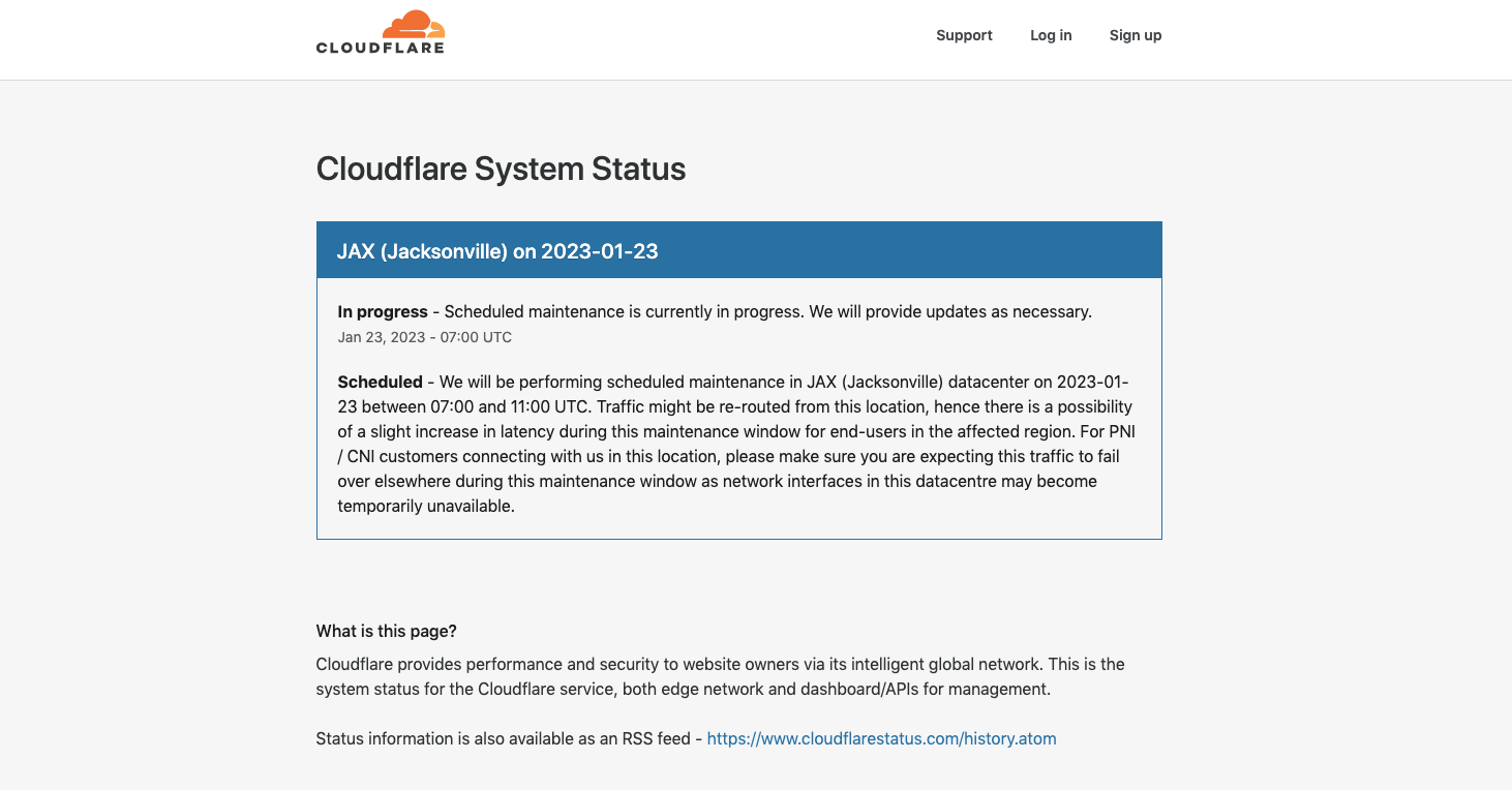
What they do: Cloudflare is a critical backbone for over 20 million websites worldwide. Primarily known for its Content Delivery Network (CDN) services, Cloudflare also offers protection against DDoS attacks and other cybersecurity threats. With its intelligent global network of multiple servers, Cloudflare plays a pivotal role in maintaining the online presence of countless businesses.
What we love about their status page: The Cloudflare status page stands out for its clear and organized design. Despite the long list of endpoints, the page manages to present the information in a user-friendly manner, making it easy for users to understand the status of each endpoint. The page also provides a direct link to the support page, allowing users to seek assistance quickly and efficiently when needed.
What we don’t like about their status page: However, the Cloudflare status page does have room for improvement. Given the extensive list of endpoints, the absence of a search function is a noticeable drawback. A search function would allow users to quickly locate the status of a specific endpoint, enhancing the usability of the page. This addition could significantly improve the user experience, making it easier for users to navigate the extensive list of endpoints.
| What we love | What we don’t like |
| ✅ Announcements | ❌ Too complicated |
| ✅ Branded design | ❌ Only RSS feed available |
| ✅ Updates history | ❌ No subscribe feature |
| ❌ No uptime history and stats |
3. Coinbase
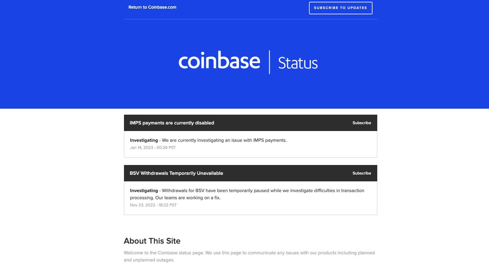
What they do: Coinbase is not just another cryptocurrency exchange, it’s one of the most trusted platforms in the digital currency world. As the first regulated Bitcoin exchange in the United States, Coinbase has set a precedent in the industry, providing a secure and reliable platform for cryptocurrency transactions.
What we love about their status page: The Coinbase status page strikes a balance between simplicity and functionality. Users can subscribe to updates, ensuring they’re always in the know about the platform’s status. The minimalistic design of the page is clean and straightforward, making it easy for users to understand the current status at a glance. Additionally, the page provides incident updates, offering users insight into any issues that may be affecting the platform’s performance.
What we don’t like about their status page: Despite these positive aspects, the Coinbase status page does have a few shortcomings. Notably, it doesn’t allow users to expand each monitor specifically to see more details or the status bar. The page provides only the current status, with little to no additional details.
This lack of depth can leave users wanting more information, especially during times of disruption or downtime. Enhancing the level of detail provided could significantly improve the user experience on the Coinbase status page.
| What we love | What we don’t like |
| ✅ Subscribe to updates feature | ❌ Complicated design |
| ❌ 3rd party URL address | |
| ❌ No branding – powered by 3rd party |
4. Netflix
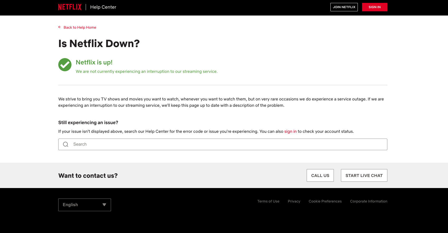
What they do: Netflix is a global leader in the streaming industry, boasting nearly 231 million paid subscribers. As a platform that provides endless entertainment to millions of people worldwide, Netflix’s service status is of paramount importance to its users.
What we love about their status page: However, when it comes to the status page, Netflix’s approach is disappointingly simplistic. The page’s design is so basic that it leaves users wondering whether it ever gets updated.
What we don’t like about their status page: The simplicity of Netflix’s status page is a double-edged sword. On the one hand, it’s easy to navigate, but on the other, it’s so minimalistic that it’s hard to tell if it’s ever updated. This lack of apparent activity could negatively impact user trust, as subscribers may question the reliability of the information provided. In an industry where customer trust is key, this is an area where Netflix could certainly improve.
| What we love | What we don’t like |
| ✅ Customer support contact | ❌ No transparency |
| ❌ No bars and history | |
| ❌ No subscribe feature |
5. X (formerly Twitter)
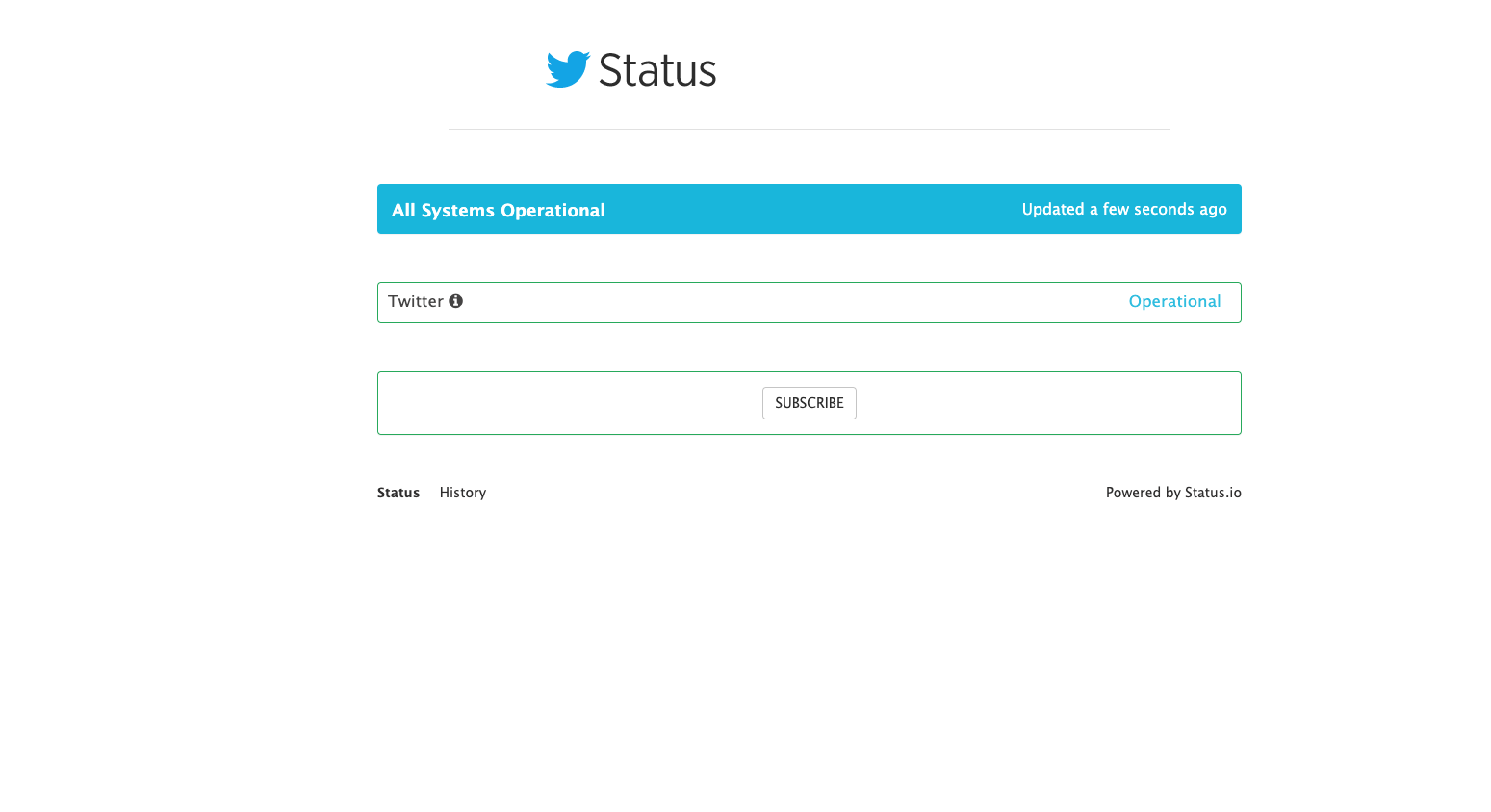
What they do: X, formerly Twitter, is a social media giant that has transformed the way we communicate and share information. With millions of active users worldwide, X has become a go-to platform for real-time updates, making its status communication a crucial aspect of its service.
What we love about their status page: The status page is different from others. However, upon first glance, it becomes apparent that X’s status communication could use some improvement. The status page appears to be outsourced to a third party, and it lacks the detail and updates one might expect from a platform of X’s magnitude. The URL address is also complex, which can be off-putting for users seeking quick and easy access to the platform’s status.
What we don’t like about their status page: The minimalistic approach to X’s status page does little to inspire confidence. It’s so bare-bones that we would hesitate to provide our email for subscription purposes. Moreover, the page claims that there have been no incidents in the last six months, a statement that seems implausible for a platform as large and active as X. This claim is further called into question by numerous user reports of downtime incidents during this period. This discrepancy could potentially undermine user trust in the platform’s status communication.
| What we love | What we don’t like |
| ❌ Overall design | |
| ❌ No transparency | |
| ❌ No updates and details |
6. Shopify
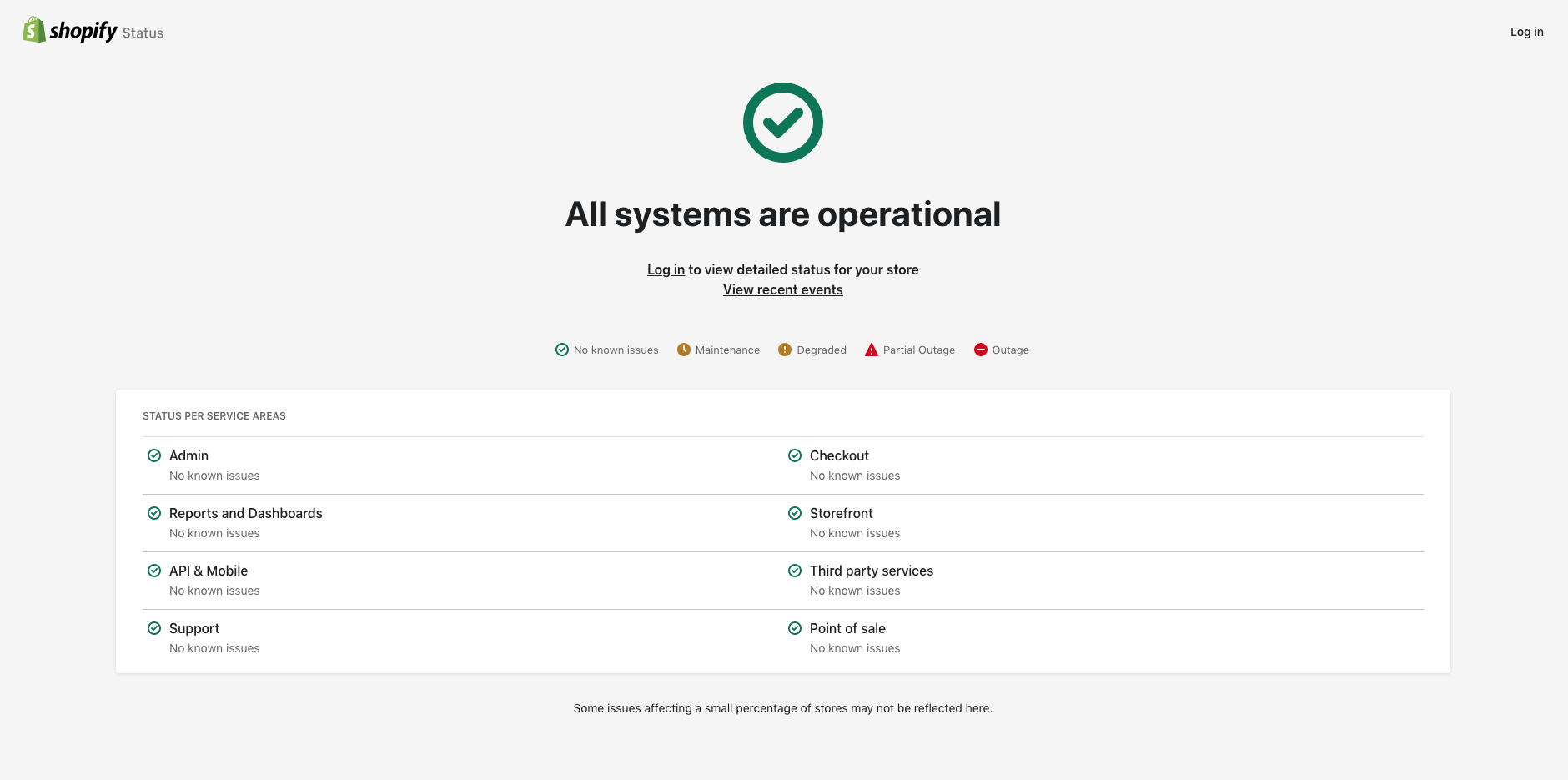
What they do: Shopify is an e-commerce platform that is a digital lifeline for more than 4.4 million online businesses around the globe. As a platform that empowers businesses to create, manage, and grow their online presence, Shopify plays a pivotal role in the world of e-commerce.
What we love about their status page: However, when it comes to the uptime status page, Shopify’s approach leaves room for improvement. Given the platform’s extensive user base and the critical role it plays in their businesses, one might expect a detailed and easily accessible status page.
What we don’t like about their status page: Unfortunately, the Shopify status page falls short in this regard. The most significant drawback is the requirement for users to log in to view more detailed information and updates.
This additional step not only consumes valuable time but also serves as a deterrent for many visitors. In an era where instant access to information is expected, this login requirement could be seen as a hurdle, potentially impacting the user experience negatively.
| What we like | What’s missing |
| ✅ Overall status for every service | ❌ No details |
| ❌ You must log in to view updates | |
| ❌ No subscribe feature |
7. Slack
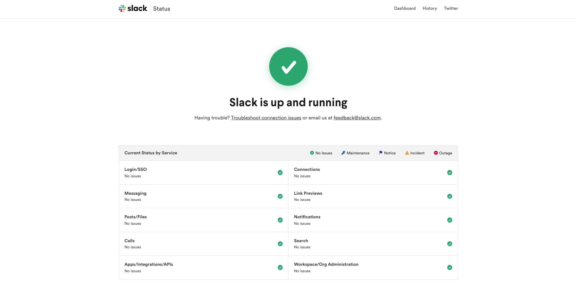
What they do: Slack is more than just another tool for online communication, it’s a platform that has become integral to the daily operations of countless companies worldwide. With its seamless integration of various work tools and user-friendly interface, Slack has revolutionized the way teams collaborate, making it a favorite among businesses of all sizes.
What we love about their status page: Slack status page is also confirming the purpose of a clean design. You will immediately notice what’s the status with an option to contact their support and troubleshoot connection issues yourself. You can even subscribe to updates, but only through RSS and Atom feeds.
What we love about their status page: The Slack status page is a testament to the power of simplicity and clarity in design. Upon landing on the page, users are immediately presented with the current status of the service, eliminating any guesswork. The page also provides an option for users to contact support and troubleshoot connection issues independently, empowering them to resolve minor issues without delay.
Additionally, the status page offers a subscription option for updates, albeit only through RSS and Atom feeds, keeping users informed about the platform’s status at all times.
What we don’t like about their status page: Despite its many strengths, the Slack status page does fall short in a few areas.
Notably, it lacks updates or detailed information about upcoming maintenance, leaving users potentially unprepared for service disruptions. Furthermore, the absence of an email subscription option for updates means that users must rely on RSS and Atom feeds, which may not be as convenient or accessible for everyone.
8. Salesforce
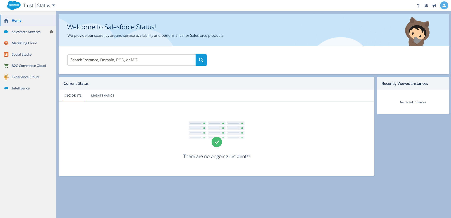
What they do: Salesforce is a global powerhouse in the realm of customer relationship management (CRM) platforms. It’s a trailblazer that provides robust and versatile CRM solutions to a multitude of businesses, including industry giants like Spotify and Amazon Web Services.
What we love about their status page: The Salesforce status page stands out for its customization and attention to detail, setting it apart from many of its competitors. It provides a wealth of information, offering a comprehensive overview of the platform’s status. This level of detail can be incredibly useful for users who need to understand the specifics of any issues or disruptions.
What we don’t like about their status page: However, the Salesforce status page is arguably a case of ‘too much of a good thing’. The abundance of details can make the page somewhat difficult to navigate, especially for users who simply want to check the platform’s overall status.
Additionally, despite the wealth of information provided, the page surprisingly lacks some basic features. Most notably, there is no option to subscribe to updates, which means users must manually check the page to stay informed about the platform’s status. This omission detracts from the user experience and could be improved to enhance the platform’s overall service.
| What we like | What we don’t like |
| ✅ Custom and branded design | ❌ Too technical |
| ❌ Hard to navigate | |
| ❌ No subscribe feature |
9. GitHub
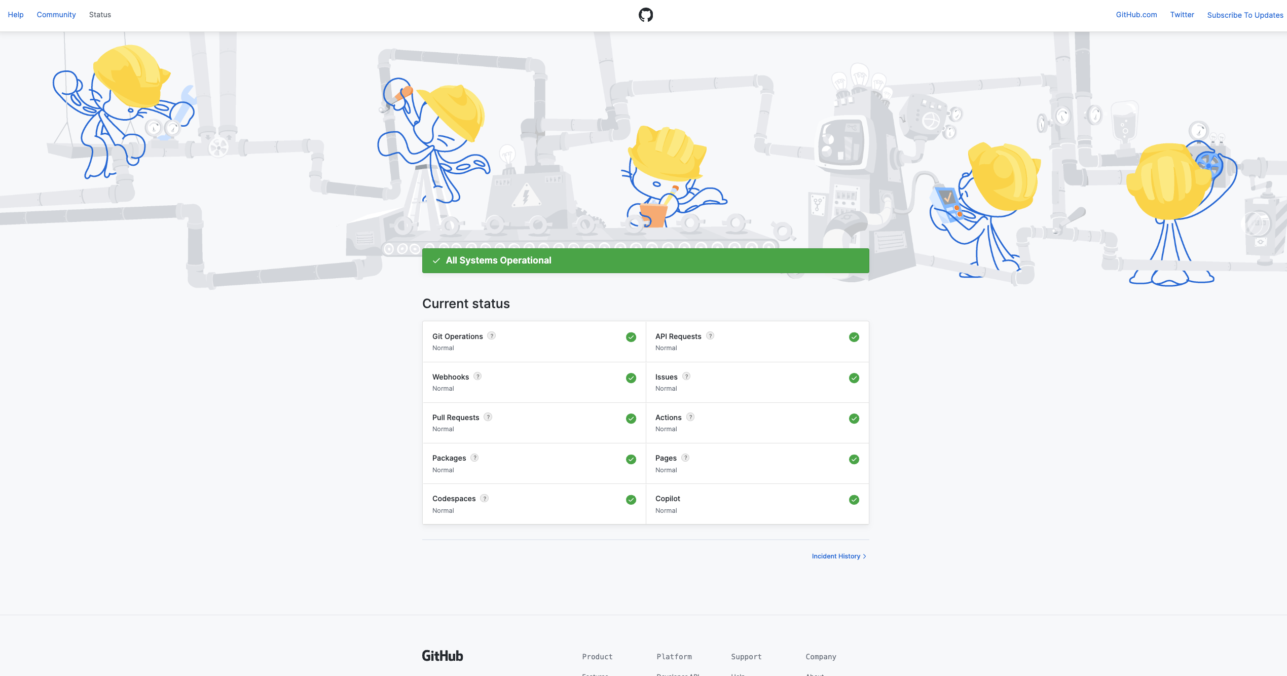
What they do: GitHub is a renowned platform that has become synonymous with version control and code sharing. It’s a hub for developers worldwide, fostering collaboration and innovation in the tech community.
What we love about their status page: The GitHub status page is a reflection of the platform’s strong branding. The unique header image featuring Octocats is a delightful touch that adds personality to the page. The design is minimalistic, aligning with the platform’s ethos of simplicity and efficiency.
What we don’t like about their status page: However, the GitHub status page does fall short in a few areas. It lacks detailed information for each endpoint, which could leave users wanting more context during a service disruption. Additionally, the incident history is limited, restricting users’ ability to track past issues. Enhancing these aspects could significantly improve the user experience on the GitHub status page.
10. Reddit
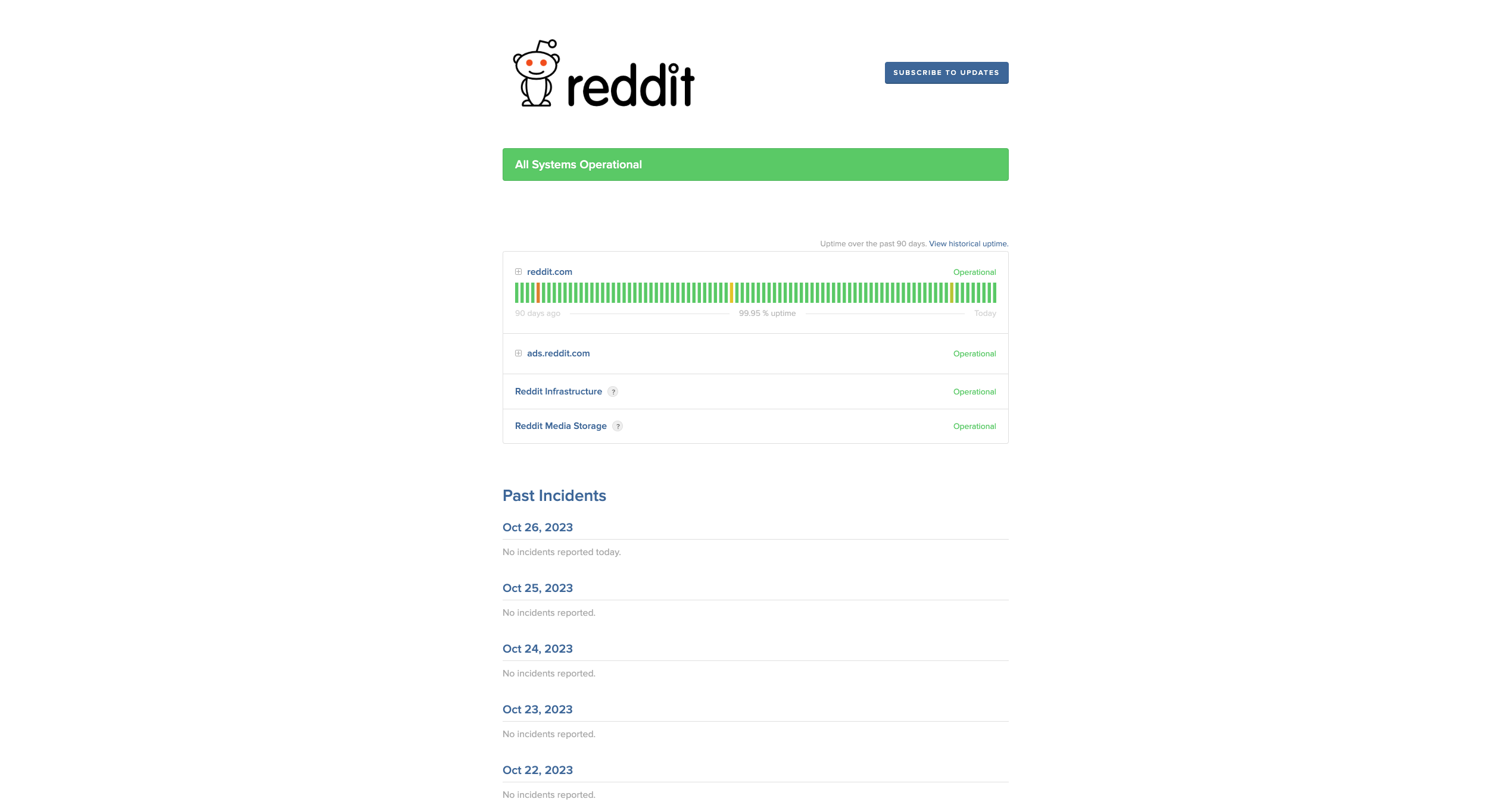
What they do: Reddit is a popular online platform that has revolutionized the way people share and discuss information. Known as the “front page of the internet,” Reddit hosts a vast array of communities covering virtually every topic imaginable.
What we love about their status page: The Reddit status page is well-designed and user-friendly, offering a subscription option for updates, which is a valuable feature for users wanting to stay informed about the platform’s status. The visibility of the status bar for the main page is also a positive aspect, providing users with a quick overview of the platform’s current status.
What we don’t like about their status page: However, there are a few areas where the Reddit status page could improve. The page used to include system metrics, which were a useful feature that is now noticeably absent.
Also, the status bar is only visible for the main page, limiting its usefulness for users interested in the status of specific sections of the site.
Lastly, the page displays the number of days without incidents, which takes up considerable space without providing significant value to the user. Streamlining these elements could enhance the overall user experience on the Reddit status page.
Why Are Status Pages Valuable And Necessary?
Every SaaS business knows the importance of a status page. It’s already an established standard that provides your users with important incident metrics and maintenance updates.
Roughly 50% of users would stop doing business with a company after just one bad experience. Minimizing the unavailability of your service is therefore the main goal for many companies.
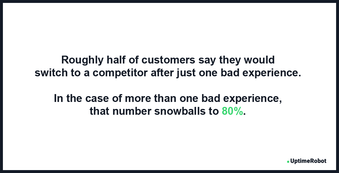 Source: Zendesk Customer Experience Trend Report
With the help of a status page your users will be aware of any upcoming maintenance and are far less likely to complain on social media.
The benefits of a status page include:
- Reduced number of support tickets during incidents
- Improved trust and relationship with your users
- Decreased frustration and bad reviews on social media
- Improved and branded incident communication
- Better team collaboration and cost savings
- Improved customer satisfaction
To set up a status page, you don’t have to worry about complicated technical stuff. The easiest and most effective way to start a status page is to use a pre-prepared one. In doing so, you’ll just need to adjust it to your needs and branding.
Many companies like Pingdom offer only 1 status page with an outdated design and limited functionality.
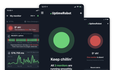
With UptimeRobot you’ll get multiple status pages that you can use for different teams or clients. These status pages are advanced, modern, and straightforward.
What Real Status Pages Do Better Than Polished Ones
The best status pages are not the prettiest. They are the clearest. When users check a status page, they are already dealing with a problem. Their goal is fast context, not visual inspiration.
Real-world examples show a consistent pattern: the message comes first. Effective status pages state the issue in plain language, identify affected components, and give a timestamp. Users should know within seconds whether the problem impacts them.
Specificity builds trust. “Investigating elevated error rates on API requests” is more useful than “We’re aware of an issue.” Even if the root cause is unknown, naming symptoms and scope shows active understanding, not generic reassurance.
Update cadence matters more than length. Short, frequent updates beat long explanations posted late. A simple “Still investigating, next update in 15 minutes” reduces refresh loops and support tickets. Silence creates more frustration than bad news.
Good status pages separate current state from history. Ongoing incidents are clearly labeled and easy to scan. Resolved incidents stay visible with clear timelines and final outcomes. Hiding past issues undermines credibility and removes learning context for users.
Another common trait is consistency. The tone, structure, and terminology stay the same across incidents. Users learn how to read the page quickly. Inconsistent wording or layout forces them to re-interpret updates during every outage.
Notably, strong status pages avoid speculation. They do not guess at causes or promise resolution times they cannot meet. Overconfidence backfires when updates need to be revised. Cautious, factual language ages better during long incidents.
Finally, the best examples treat the status page as part of the system, not an afterthought. They load fast, work on mobile, and stay available even when core services are degraded. A status page that goes down during incidents defeats its purpose.
The takeaway from real examples is simple. Users value clarity, honesty, and rhythm over design flair. A status page succeeds when it answers questions quickly and updates reliably under pressure.
Best Practices And How They Help
As you will see in the real-world examples below, many well-known companies are using these steps to get the most out of their status pages.
Focus on clean design
One of the biggest benefits of a status page is that your users will be able to quickly get the information they need. Whenever your service isn’t working, your users should be able to check your status page before contacting your support team.
Therefore, a simple but informative status page should be your first goal. Include necessary details only, like the status of your services, status bars, overall percentage, and short updates.
Get an easy-to-remember URL address
The majority of online businesses use a reachable and easy-to-remember domain name such as status.yourdomain.com. It’s a widespread practice that many people are already familiar with, so usually, it’s the first address they try when they need to check your status.
We recommend you use this well-known formula to create your own custom domain name, which will not only make your status page easier to find but will also enhance your overall branding.
Customize your status page
Similar to having a custom URL address with your domain name, customizing your status page is a considerable part of your branding. You should be able to include your logo and favicon, preferably with custom colors and fonts.
According to research, more than half of brand first impressions are visual.
Simply put, your users trust you more when they see your colors.
Source: US Chamber of Commerce
While the way your status page looks is important, you should also be able to adjust other details, like what’s shown and how.
Add a link to your website
Your status page should not only have a link leading to your website but it should ideally be accessed by clicking on your logo.
Make sure you also add your status page URL address to your website, preferably in the footer or menu, on your contact and documentation pages, and to the auto-replies in the customer support chat. For offline documentation or record-keeping, you can convert URL to PDF to create archived versions of your status page. You can also include it in your e-mails. For example, add a line about your status page to the welcome message, or include a link to the footer of every e-mail.
In doing so, your users will know where to find your status page and can save it. It’s a good idea to consider sharing it on your social media profiles as well.
Use status updates
Status updates are an essential feature of any status page. You should be able to share updates on your status page to inform users about upcoming maintenance or details about past events.
Some advanced status pages (you can grab one for free from UptimeRobot) allow your users to subscribe to updates, so they will receive e-mails about any unavailability or important updates.
Start building trust
Nearly every customer loves a transparent company. According to research, almost 94% of users are more likely to continue using your service when they see that you commit to transparency.
Having a status page is one of the best ways to build relationships with your users.
Source: Inc.com
Conclusion
So what are the most important components that every status page should include? Let’s summarize them:
- Simple and branded design
- Easy-to-remember URL address
- Details about uptime
- Updates and uptime history
- Announcements and updates
- Option to subscribe for updates
You will get all of these with a status page from UptimeRobot. It’s modern and detailed and allows you to send updates about upcoming maintenance or recent incidents to your subscribed users, or protect the status page with a password.
It only takes a few clicks.
FAQ’s
What is a status page used for?
A status page communicates the current health of your service to users. It shows whether systems are operational, degraded, or down. The main goal is to reduce uncertainty and support load during incidents.
What makes a good status page example?
Good status pages are clear, current, and honest. They show affected components, update timestamps, and plain-language explanations. Overly vague or outdated pages quickly lose user trust.
Should a status page be public or private?
Public status pages are best for customer-facing services. Private status pages can work for internal systems or teams. The choice depends on who needs visibility during incidents.
How detailed should incident updates be?
Updates should explain what’s affected, what’s being done, and when the next update will arrive. You don’t need deep technical details, but silence or one-line updates frustrate users. Consistent updates matter more than perfect wording.
How often should a status page be updated during an outage?
Update the status page whenever there’s meaningful new information or progress. Even short “we’re still investigating” updates reassure users. Long gaps create confusion and repeated support requests.