Status pages help you communicate clearly and quickly with your customers. A good status page keeps everyone informed about operational updates, ongoing incidents, degraded service, or full outages, all in real time. It gives you full control over communication, letting you decide what to say, when to say it, and how to say it.
In this 2026 guide, we’ll show you how to plan, design, and launch a professional status page step by step. You’ll learn how to choose the right tools, structure your updates, automate incident handling, and set up smart notification rules.
Here’s what you will get inside:
- Templates you can plug in and use right away
- Step-by-step guidance for building your status page
- Real status page examples from companies that are doing it right
And yes, stick around till the end to grab your free Status Page Pro Kit and kickstart your own status page.
Key takeaways
- A status page shows the current operational health of your systems in one place.
- You can keep it public, private, or limited to a specific audience depending on your needs.
- There are three main ways to create one: DIY, hosted, or integrated solutions.
- Communicate early and consistently during incidents.
- Keep the design simple, readable, and aligned with your brand.
- Use clear, human language instead of technical terms.
- Include incident history to maintain transparency and accountability.
- Automate updates with APIs and webhooks for real-time accuracy.
- Define and display clear status categories or impact levels.
- Review and close stale incidents regularly to maintain credibility.
- Small teams and startups benefit just as much as large enterprises.
- Tools like UptimeRobot make it simple to build and maintain a professional, reliable status page.
Status page fundamentals
Before we dive deeper, let’s go over the fundamentals. We’ll look at what a status page does and the main types you should know.
What is a status page (and how does it differ from an incident page)?
A status page is a live, public (or private) webpage that shows the current operational health of your system, service, or application, all in one place. It keeps users informed about uptime, performance, and any ongoing or past issues.
An incident page, on the other hand, focuses on a single issue. It tracks one specific outage or disruption, from detection to resolution, and provides detailed updates as the issue unfolds.
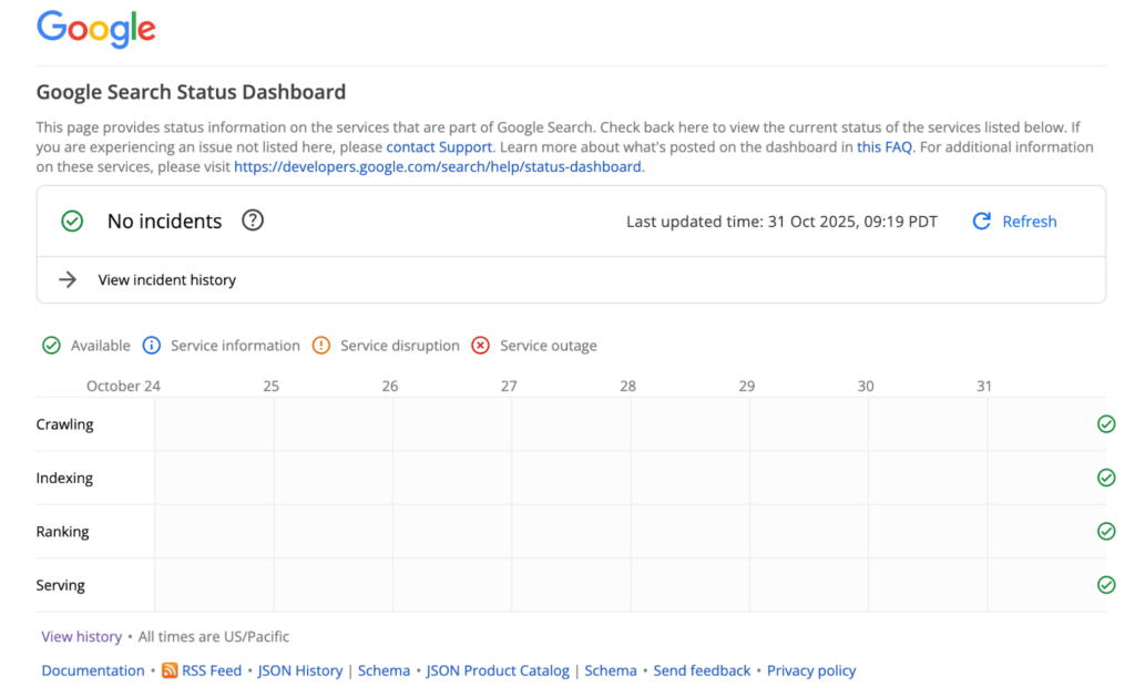
Figure 1: Screenshot of Google search status page.
Look at Google’s status page for reference. It lists all its services along with their current status. At the top, it highlights whether there are any ongoing incidents. The status page also lets users view details of past events through the incident history section.
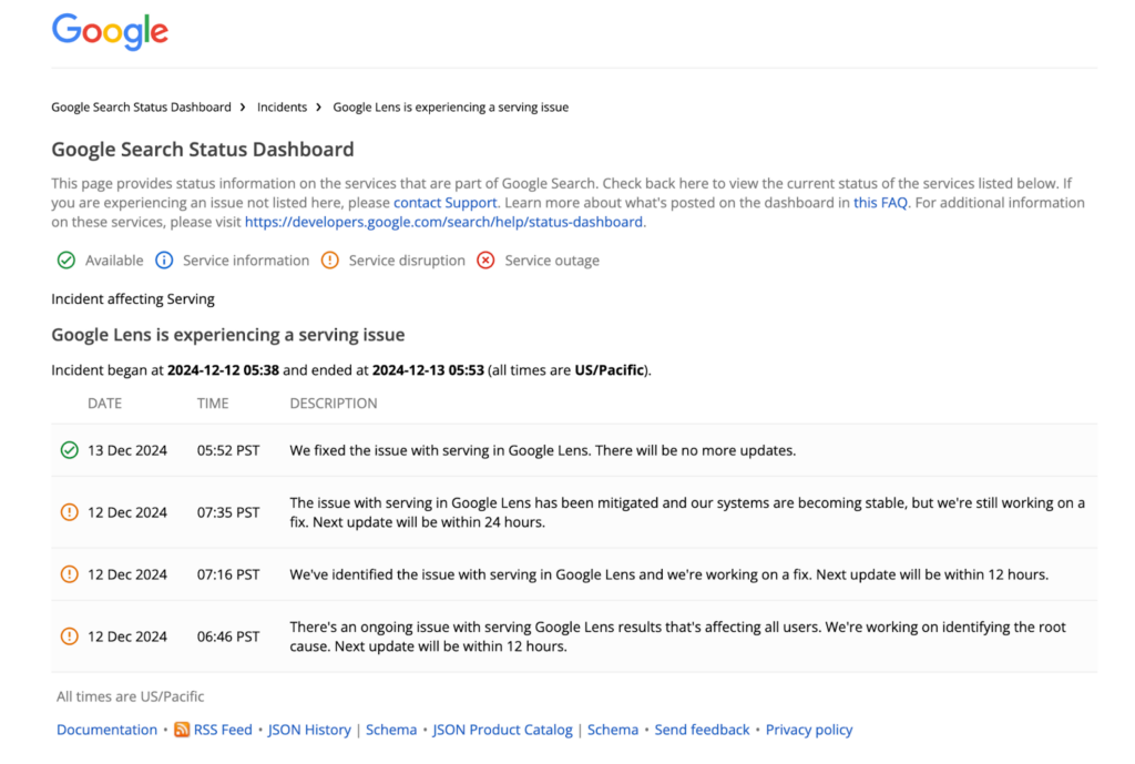
Figure 2: Screenshot of Google search incident page.
An incident page, like the one shown here, provides more detailed information about a particular issue. For example, this incident timeline for “Google Lens is experiencing a serving issue” outlines what went wrong, when it started, and how it was eventually resolved.
Top 5 status page benefits
The key advantages of implementing a status page are:
- Boosting transparency and trust: Reassure your users of your commitment to high-quality service and full transparency.
- Streamlining incident management: A status page centralizes your communication, allowing you to post updates about any incidents from a single location.
- Making updates easy to share across channels: Status pages can easily be shared on social media, reaching a wide audience with little effort.
- Automating incident reporting: Integration with monitoring platforms allows for the automatic creation and resolution of incidents.
- Reducing customer support queries: A well-maintained status page offers immediate answers to users experiencing service disruptions, cutting down on the volume of direct support requests.
Public vs. private vs. audience-specific status pages
You can keep your status page public, private, or visible only to a specific audience, depending on who needs the information.
A public status page is open to everyone. It’s ideal for SaaS companies, APIs, or online platforms where customers or developers need to see real-time service status. Public pages promote transparency and help reduce incoming support tickets during outages.
A private status page is restricted to internal teams or specific stakeholders. It’s useful for IT departments, managed service providers, or organizations that want to keep operational visibility without sharing details publicly.
An audience-specific status page falls somewhere in between. It allows you to create tailored views for different groups. For example, showing certain components to enterprise clients, while internal teams see full system details.
Many companies use a mix of these approaches. For instance, they might have one public status page for users and developers, and another private one for internal monitoring or partner communication.
| Type | Who can see it | Ideal for | Pros | Cons |
| Public | Everyone | SaaS platforms, APIs, public-facing apps | Builds transparency, reduces support load, strengthens trust | Requires careful communication; visible to competitors |
| Private | Internal teams only | Enterprise IT, DevOps, or multi-product environments | Keeps internal systems monitored; avoids public exposure | Limited customer visibility |
| Audience-specific | Custom access per customer, region, or service tier | Large B2B SaaS, multi-tenant systems | Personalized transparency reduces noise for customers | More setup and maintenance effort |
DIY vs. hosted vs. integrated solutions
There are three main ways to create a status page: DIY, hosted, or integrated solutions, each offering different levels of cost, flexibility, and reliability.
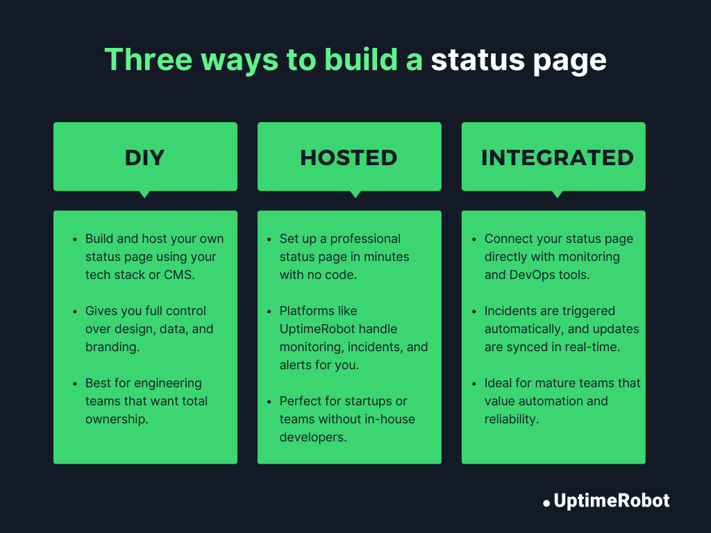
Figure 3: Three ways to build a status page: DIY, hosted, and integrated
- DIY status page
A DIY status page means building and hosting it yourself using your own tech stack or CMS. This approach gives you complete control over the design, layout, and data sources. It is perfect if you want a fully customized or white-labeled experience.
The trade-off is the extra effort. A DIY setup requires ongoing development time, manual monitoring, integrations, and regular maintenance. It’s best suited for engineering-focused teams that already manage internal tools and want full ownership of their status page.
- Hosted status page
If you don’t have an in-house technical team, a hosted status page is the easiest and fastest way to get started. Platforms like UptimeRobot, Statuspage, and Better Stack let you launch a polished, fully functional status page in minutes with no coding required. They include built-in monitoring, incident management, and automated notifications.
While hosted pages save time and effort, they offer less flexibility for deep customization or unique branding and usually come with a subscription cost.
- Integrated status page
An integrated status page takes things a step further by connecting directly to your existing monitoring or DevOps tools. For instance, integrating UptimeRobot’s monitoring with your incident management system creates a seamless workflow where incidents trigger automatically, updates appear on your status page in real time, and your team can focus on fixing the issue instead of manually communicating updates.
This kind of setup offers the ideal balance of automation, reliability, and control, though it does require some initial configuration.
Once you’ve decided which approach fits your setup, the next question is cost and control. Should you maintain a free solution yourself, or use a paid service with built-in features and automation? Here’s how the two compare.
Free vs. paid status pages: what’s the difference?
If you’re setting up a status page, you’ll likely choose between a free (or open-source) solution and a paid hosted service.
The right option depends on how much automation, customization, and reliability you need, along with how much time you want to spend maintaining it.
Here’s a simple comparison:
| Paid status pages | Free / open-source status pages | |
| Cost | From $7 per month | Free |
| Features | Custom domain, password protection, automated updates | Basic functionality |
| Customization | Logo, fonts, brand colors | Limited branding |
| Number of monitors | 3, 100, or more | Typically 1 |
Free solutions can work well for small projects, internal tools, or early-stage products with minimal monitoring needs.
But as your service grows, managing infrastructure, updates, integrations, and uptime communication yourself can become time-consuming. A hosted solution removes that maintenance burden and gives you built-in automation, branding control, and scalability.
If you want to publish a branded status page quickly and connect it directly to your monitoring setup, a paid service is often the more practical choice.
You can create and customize a status page in minutes using UptimeRobot’s Status Pages feature.
Status page best practices
Building a status page is only half the job. Running it well is what truly builds credibility. Here are the key fundamentals that turn a good status page into a great one.
Clear messaging for incidents
While you and your team have the technical expertise, your users might not. They want clear updates without confusing technical jargon. Start each message by explaining what’s affected, how it impacts users, and what’s being done to fix it.
Avoid vague statements like “We’re looking into it” unless you follow them with a specific next step or estimated update time. Keep your language short, factual, and calm. The goal is to reassure users that the issue is under control, not overwhelm them with details.
Here’s a great example of clear, user-focused incident communication by Freshchat. Each update clearly states what’s affected, why it’s happening, and what the team is doing to fix it without relying on technical jargon.
The timeline reflects steady progress, keeping users informed and confident that the issue is under control. The final resolution message closes the loop with gratitude and reassurance, reinforcing trust and transparency.
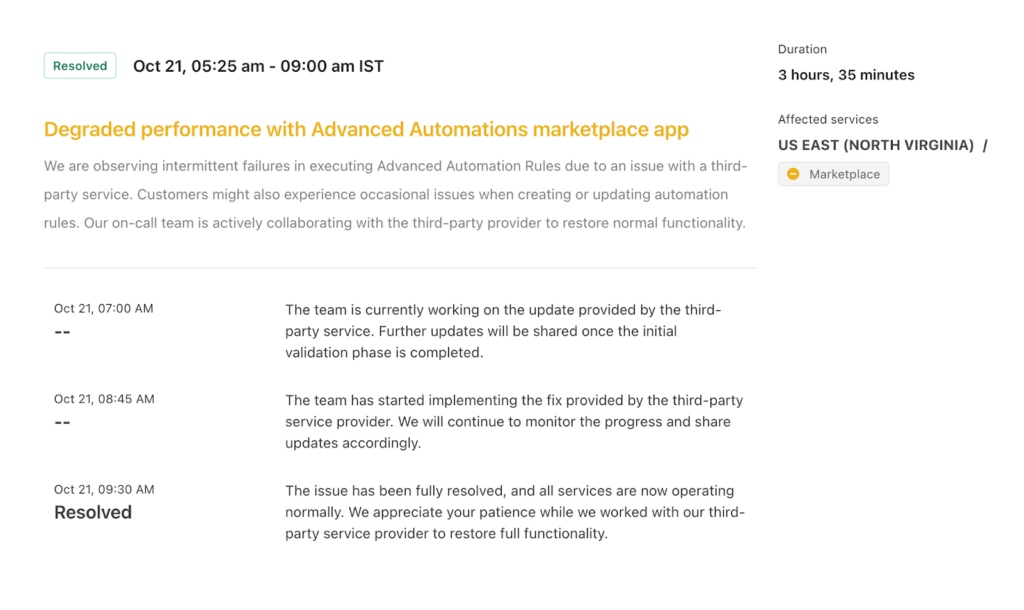
Figure 4: Example of clear, effective incident communication by Freshchat
Defining severity levels and status vocabulary
Defining clear severity levels helps your team and customers understand how serious an incident is. Use consistent labels like operational, degraded performance, partial outage, and major outage, and pair them with simple color cues or icons for quick scanning.
Within your team, align on what each level means so everyone knows when a “partial” issue becomes “major.” This shared language keeps communication clear, consistent, and predictable.
Freshchat does this really well by using clear severity labels and color codes that instantly show the impact level at a glance.
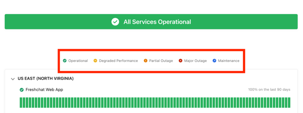
Figure 5: Freshchat defines severity levels and uses color coding for quick understanding
Update cadence during outages
One of the biggest mistakes you can make during an incident is to go silent. Even if there’s no major progress, keep communicating. Aim to post updates every 30 to 60 minutes for high-impact outages and every 1 to 2 hours for smaller issues.
You don’t always need new information; sometimes a simple “Our team is still working on it. Next update in 30 minutes.” goes a long way. Remember, users lose trust faster when there’s no communication than when there’s no fix.
In the Freshchat example, notice how updates were shared consistently throughout the incident. Each message came at regular intervals, even before the issue was fully resolved. That steady rhythm keeps users informed, builds trust, and shows accountability.
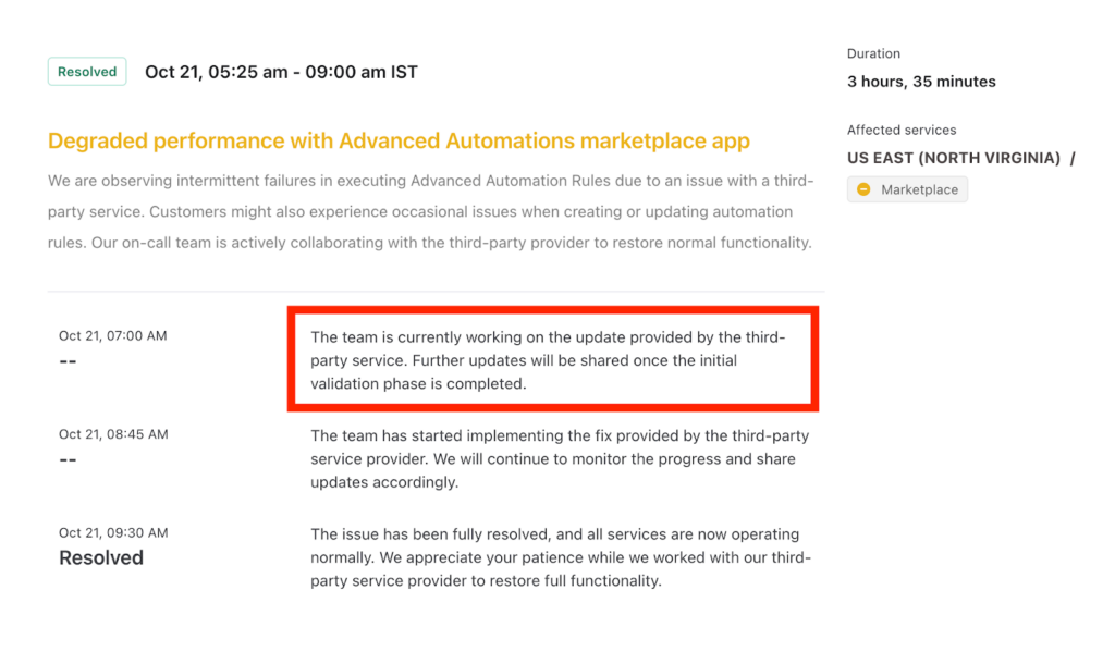
Figure 6: Freshchat maintains consistent updates to build accountability and user trust.
Balancing transparency vs. oversharing
Transparency builds trust, but too much detail can create confusion or risk. Focus on what users actually need. Tell them what’s affected, how long it might last, and when things will return to normal. Skip internal jargon, system names, or unverified causes. The goal is to be open and honest without overwhelming or alarming users.
Subscriber notifications and alert fatigue
Sending email and SMS alerts during incidents is helpful, but too many can wear users out. Let them pick what they want to be notified about, such as specific services, regions, or components. Send alerts for major incidents, important updates, and resolutions, not for every small maintenance task. When you give users control and keep notifications meaningful, they’ll stay informed without feeling overwhelmed.
Accessibility, branding, and mobile UX
Your status page should be just as dependable as your product. Make sure it loads quickly, works smoothly on mobile, and follows accessibility standards like WCAG 2.1. Keep your branding light so users recognize your company without feeling distracted. Use simple colors, clean fonts, and a layout that makes information easy to read and understand.
SEO and discoverability for status pages
Make sure your status page is easy to find when users need it most. Link it in your website footer, help center, and support emails. Add structured metadata so search engines can show real-time uptime info right in search results.
When someone searches “<your app> status,” your official page should appear first, not a random forum post. Good SEO helps users get accurate updates fast and prevents confusion during outages.
For instance, when you search “Slack status” on Google, Slack’s official status page shows up right at the top, exactly where users expect it.
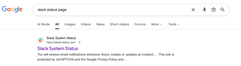
Figure 7: Slack status page Google search
Design and UX principles
A great status page does more than display uptime; it delivers reassurance. A clean, well-structured layout helps them instantly understand what’s happening, how serious it is, and what’s being done about it. Good design turns a stressful moment into a clear, confident experience.
Structuring services and components
Start by breaking your product into clear, logical parts like APIs, dashboards, integrations, or regions. Give each component its own status and history so users can quickly tell what’s affected without guessing.
This setup prevents confusion and reduces panic when something breaks (“Login is down” sounds very different from “Everything is down”). For more complex systems, use nested components (for example, Core API → Authentication → Billing) to show deeper visibility and structure.
Take UptimeRobot as an example. Our status page lists components like APIs, the blog, the knowledge hub, and monitoring systems. Each one shows its own uptime percentage and health indicator, so users instantly know which part of the platform is having trouble.
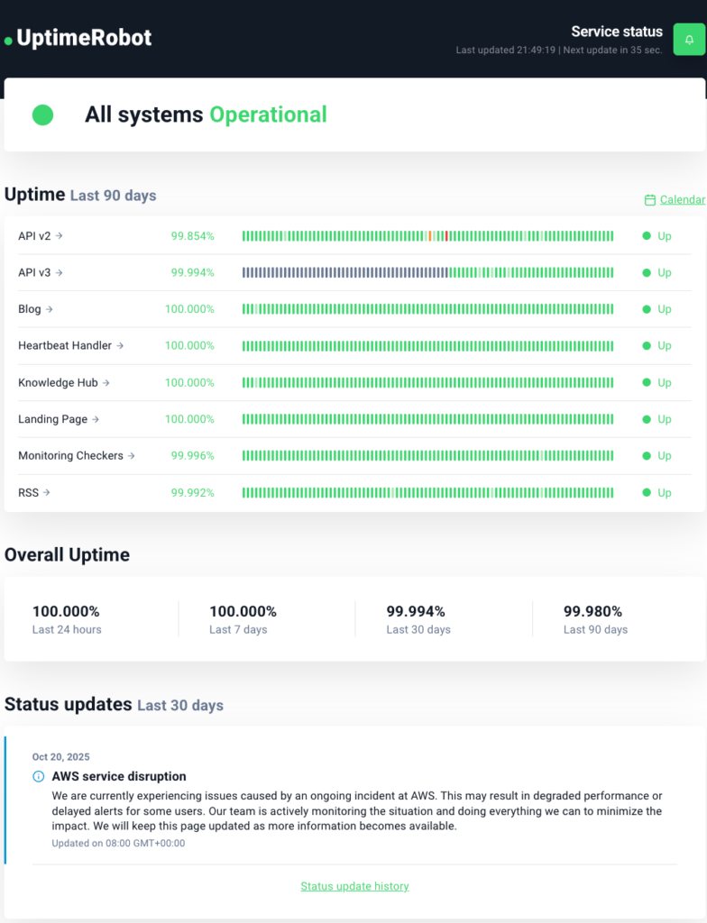
Figure 8: UptimeRobot status page showing different services and components
Layout patterns (dashboard, service groups, regional views)
The layout of your status page should reflect how users actually experience your product. The dashboard layout works best for most SaaS apps because it gives an instant snapshot of overall health in a single-page view with color-coded component rows.
For larger systems, use service groups to organize related components into clear clusters like “Core Platform,” “Integrations,” or “Developer Tools.” If your product runs across multiple data centers or regions, add a regional view so users can quickly see which geography is affected.
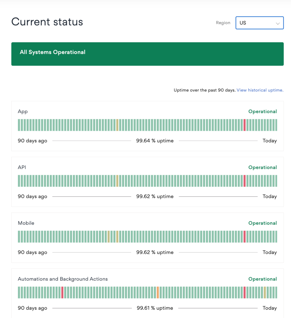
Figure 9: Asana uses a clean dashboard layout that gives users a quick snapshot of overall system health.
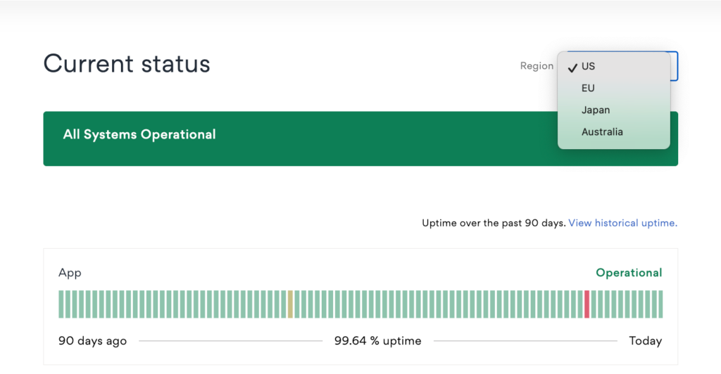
Figure 10: Asana also lets users view regional status by selecting their region from a dropdown menu.
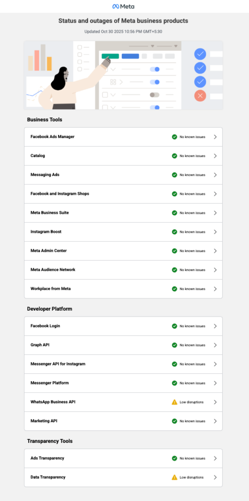
Figure 11: Meta organizes its status page by grouping related components into sections like Business Tools, Developer Platform, and Transparency Tools.
Visual design: colors, icons, and cues
Color plays a key role in how users interpret your status page, so use it carefully and consistently. Stick to familiar conventions:
- Green for operational
- Yellow for degraded performance
- Orange or red for outages
- And blue for scheduled maintenance.
Pair colors with clear icons or text labels so the meaning is accessible to everyone, including color-blind users. Avoid flashy gradients or moving animations that distract.
Timeline and incident history
A clear incident timeline lets users see your track record and understand how past issues were resolved. Each entry should include the date, impact, duration, and a short resolution note. Transparency builds trust over time, not just during outages.
To keep things easy to navigate, group incidents by month or year and collapse older ones. Many teams also include a “Past 90 Days” uptime summary to highlight consistency and accountability.
Slack does this well by displaying its uptime for the current quarter on its status page. This simple, data-first design is easy to read, regularly updated, and instantly builds user confidence without unnecessary detail.
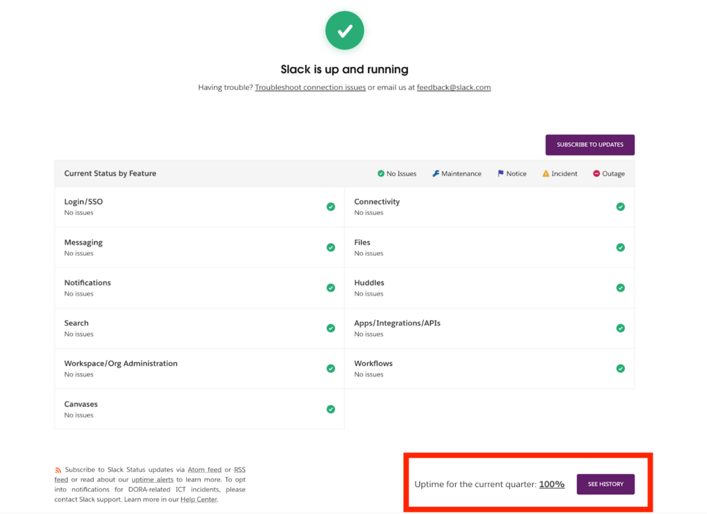
Figure 12: Slack’s status page displays its uptime for the current quarter as 100%, showcasing reliability at a glance.
Metrics and uptime charts
Add uptime charts and response-time metrics to support your incident updates with clear, visual data. Simple visuals like sparkline graphs or daily uptime bars help users quickly understand performance trends.
Focus only on meaningful metrics such as API uptime percentage, response latency, or error rate. If you’re using UptimeRobot, you can easily embed live uptime data and historical trends right on your status page, making it both dynamic and credible.
Branding, theming, and dark mode
Your status page should reflect your brand while staying clear and functional. Use your logo, colors, and typography sparingly to make it recognizable without sacrificing readability.
Offering a dark mode option is a nice touch; many users check status pages late at night or in low-light environments, and it shows attention to user comfort. Keep your design consistent with your app, help center, and notifications to build a cohesive, trustworthy brand experience.
Real-world status page examples
Before you build your own, it helps to see how the best in the business handle transparency, design, and communication. Let’s look at three standout examples and what makes their status pages effective.
Example 1: GitHub
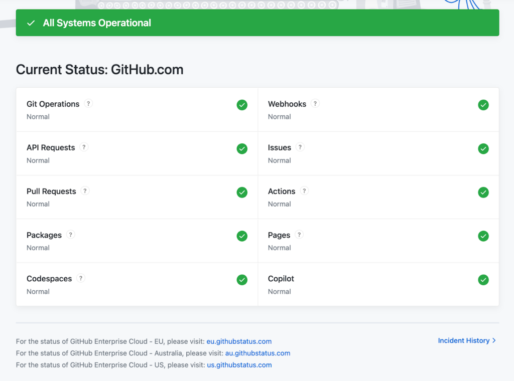
We will start with GitHub’s status page. It sets a high standard for transparency and usability. Its minimalist dashboard presents all major services, from the API and webhooks to Git operations and packages, with clear operational states that are easy to interpret at a glance.
The page also links to a detailed incident history, where users can view snapshots of past incidents, including their status, start time, and resolution time.
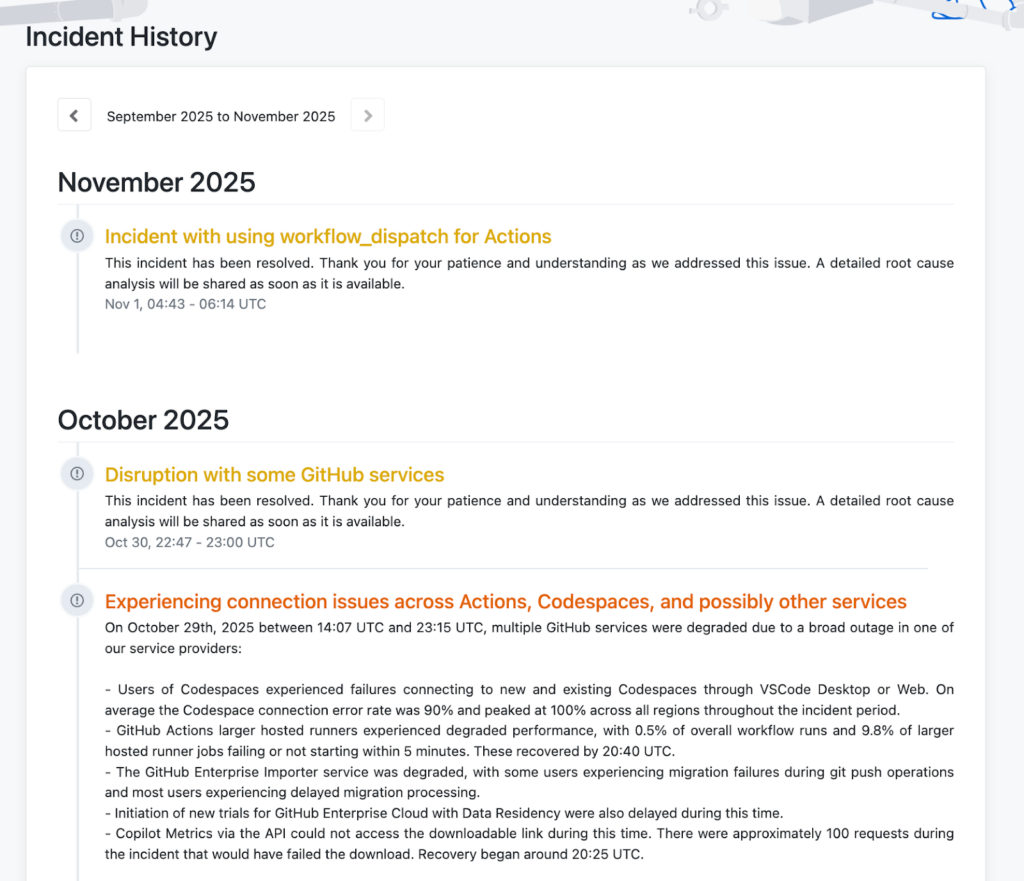
Figure 14: GitHub Incident history page
Each incident is documented with concise, structured updates that include timestamps, impact scope, and resolution details. The chronological timeline provides a quick overview of recent disruptions and long-term reliability trends, helping users evaluate GitHub’s overall service stability.
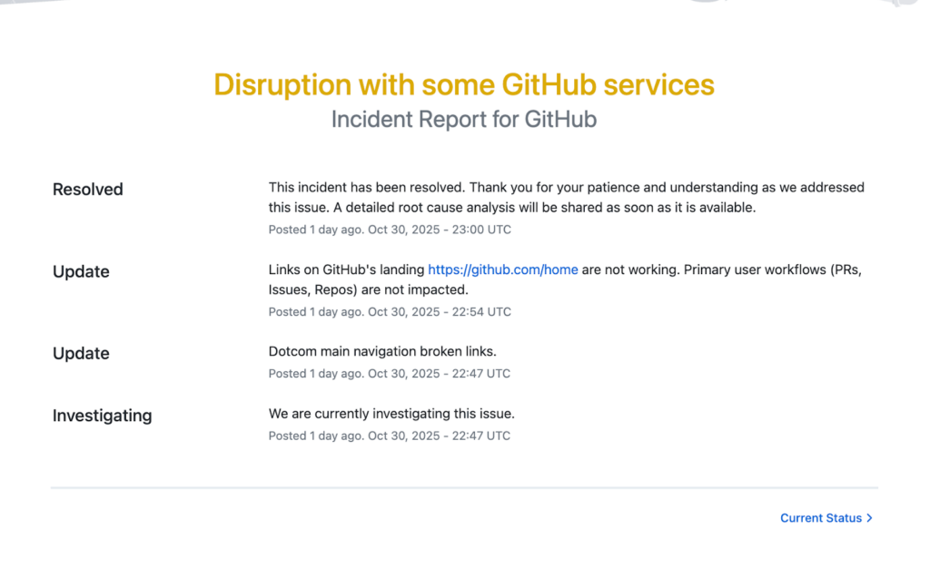
Figure 15: GitHub incident report
What it gets right
- A crisp, well-structured layout that prioritizes readability and user trust.
- Excellent SEO and discoverability, making it easy to find via search engines.
- Clear, consistent messaging that balances transparency with professionalism.
- Strong visual hierarchy and color usage, ensuring status clarity.
- Easy access to incident history allows users to review past performance.
Where it falls short
- No defined severity levels or status terminology are shared publicly, which can make it unclear how serious an incident is.
- Metrics and uptime data are missing, limiting transparency for users seeking quantifiable reliability.
- Users have to browse month by month to find past incidents, which can be tedious.
- No dark mode option, which could enhance accessibility and user comfort.
Example 2: DigitalOcean
Next is DigitalOcean’s status page. It offers a dashboard-style homepage that provides a snapshot of global and regional service health, with color-coded badges indicating real-time status. It also includes a status legend that shows labels such as operational, degraded performance, partial outage, major outage, and maintenance, each with a distinct color that helps users quickly interpret the current conditions.
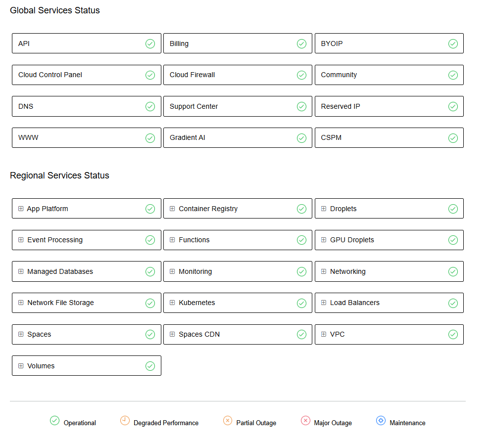
Figure 16: DigitalOcean status page
At the bottom left, there’s a link to view the incident history. The incident history page opens with an impact-level key: Critical, Major, Minor, Maintenance, and Retroactive, each color-coded for easy scanning. It lists incidents month by month, displaying their current state, a summary, and the duration.
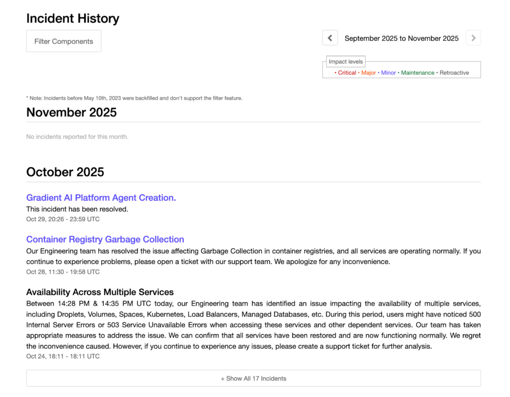
Figure 17: DigitalOcean incident history page
Each incident includes a detailed narrative, what happened, how it’s being fixed, and when it will be resolved, all written in a calm, human voice.
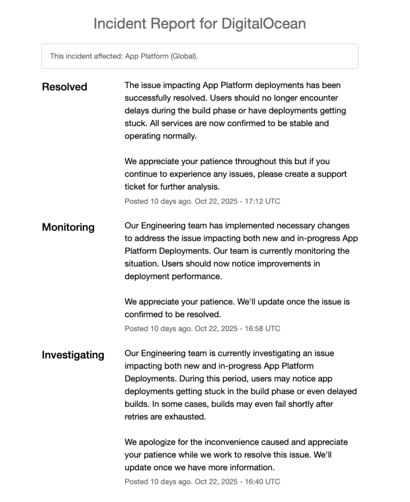
Figure 18: DigitalOcean incident report
What it gets right
- A transparent and well-organized incident communication style that builds user confidence.
- Strong storytelling tone and visual clarity make updates easy to follow.
- Good SEO and discoverability, making the page easy to find on search engines.
- The filter components option helps users quickly find relevant incidents.
Where it falls short
- The “View history” link is tucked away at the bottom left in small text, making it easy to miss.
- Lacks uptime metrics or performance data, which limits insight into long-term reliability.
- No quick date navigation. Users must browse month by month, which can be tedious.
- No dark mode option, which could improve accessibility and comfort.
Example 3: Slack
Slack’s status page puts user experience front and center. It organizes services into clear, user-focused categories like messaging, connectivity, notifications, and files. Each category uses simple emoji-style indicators to show service health at a glance.
Unlike other examples, Slack adds a “Having trouble?” section at the top with troubleshooting links and a support email, making it easy for users to get help. At the bottom, it displays uptime for the current quarter, reinforcing reliability and transparency.
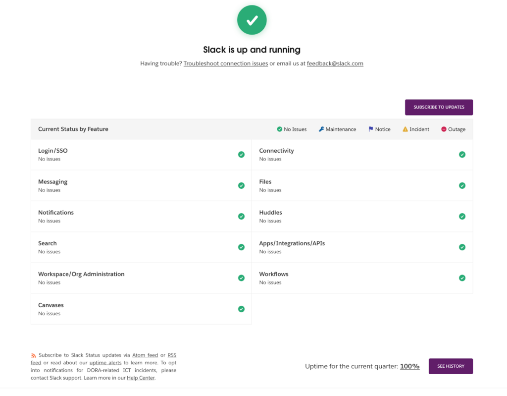
Figure 19: Slack status page
The incident history page takes a different approach with a calendar view instead of a list. You can select any date to see incidents recorded on that specific day, making it easy to navigate through past events. Dates with incidents are marked with a yellow icon, and hovering over it reveals a quick summary that includes the incident description, duration, and current status.
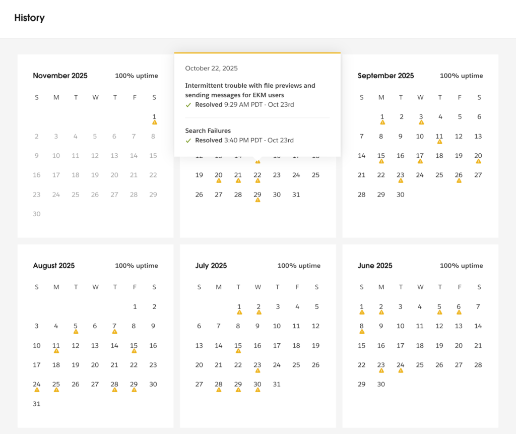
Figure 20: Slack incident history page
When you click on a date, Slack displays a full report of all incidents recorded that day. Each entry includes consistent, clear updates throughout the event and a concise summary once the issue is resolved.
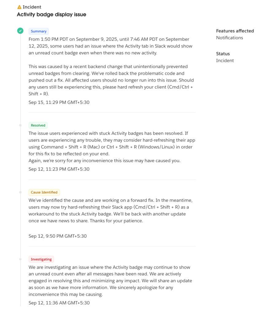
Figure 21: Slack incident report
What it gets right
- Clear, user-focused grouping of services such as messaging, connectivity, notifications, and files.
- Intuitive emoji-style indicators that make service health instantly understandable.
- Helpful “Having trouble?” section with quick troubleshooting and contact options right at the top.
- An interactive calendar-based incident history that allows easy navigation across dates.
- Clean summaries and structured updates for every incident, improving readability and trust.
- Uptime percentage for the current quarter is displayed transparently at the bottom.
Where it falls short
- No dark mode option for accessibility and visual comfort.
- Limited metrics. Response time or latency data are not shown.
- No clear severity levels or impact classification for incidents.
Also read: 10 Real-World Status Page Examples: And What You Can Learn From Them
How to build a status page with UptimeRobot
Creating a status page with UptimeRobot is quick, intuitive, and fully customizable, with no code required. You can go from zero to a live page in minutes, whether you want to share uptime with customers or track internal systems privately.
Here is a step-by-step tutorial.
- Go to the “Status Pages” tab in your UptimeRobot dashboard
Log in to your UptimeRobot account, then navigate to “Status Pages” from the left-hand menu. Click on “Create Status Page” to start setting up your first status page.
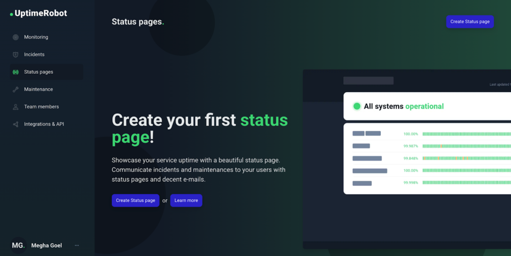
Figure 22: Click on “Create Status page”
- Choose which monitors you want to display
Start by adding required monitors to your status page. You can add all monitors, select specific ones by name, or use the Tag feature to include groups of related monitors. Each monitor (like “API,” “Dashboard,” or “Blog”) can represent a component on your status page.
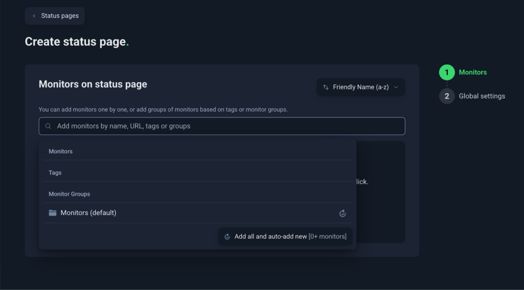
Figure 23: Choose which monitors you want to display
- Name your status page
Give your status page a clear, recognizable name. It is usually an extension of your product or brand name (for example, “Slack System Status”). This name appears in the header, title, and browser tab, helping users instantly recognize the page.
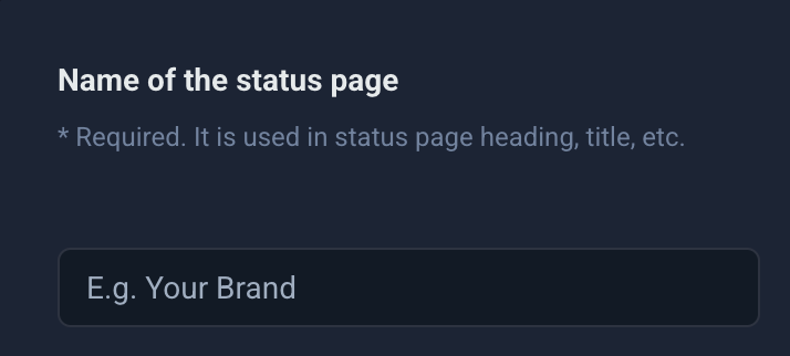
Figure 24: Name your status page
- Set your custom domain
You can host your status page on your own domain (for example, slack-status.com/). To do this, create a CNAME DNS record that points your domain to stats.uptimerobot.com.
Tip: Hosting on your own domain gives your status page a professional touch and strengthens brand consistency.
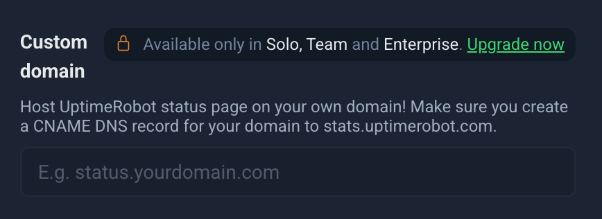
Figure 25: Set your custom domain
Please note that this feature is only available for paid customers.
- Add your brand logo
Upload your logo in JPG, JPEG, or PNG format. Keep it under 400×200 px and 150 KB for optimal performance. A clean, lightweight image ensures your page loads quickly, even during high-traffic moments.
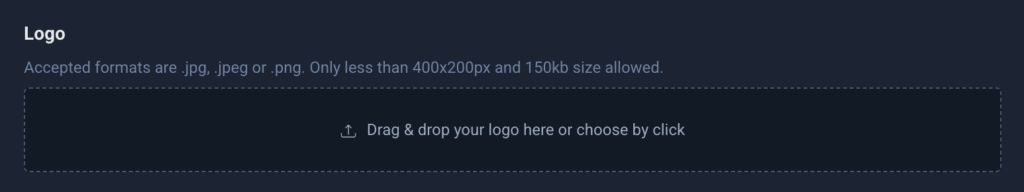
Figure 26: Add your brand logo
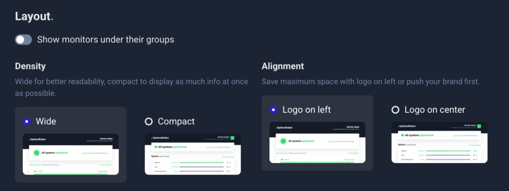
- Choose your layout
Pick the layout that best suits how your users will interact with your page.
- Wide Layout: Offers better readability and a modern, spacious design.
- Compact Layout: Displays more information on a single screen. Perfect for larger teams or multiple monitors.
- Decide who can access your page
UptimeRobot lets you control visibility:
- Public: Visible to everyone. Ideal for customer-facing pages.
- Private: Restricted access for internal use or select clients.
You can also enable password protection to make your page accessible only to specific people or teams. This is needed when you want to create a private status page.
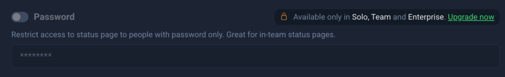
Figure 28: Choose between a public or private status page
Please note that this feature is only available for paid customers.
- Control search visibility
Under the “Meta Robots” setting, choose whether search engines can index your page:
- Set to index if you want it discoverable via Google.
- Set to noindex to keep it private and hidden from search results.
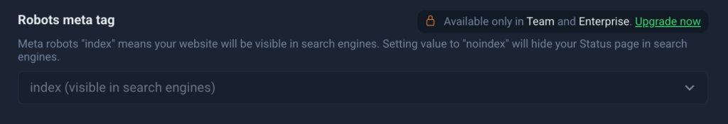
Figure 29: Control search visibility
Please note that this feature is only available for paid customers.
- Click “Finish” to publish your status page
Once live, your status page will automatically show uptime and incidents from the selected monitors.
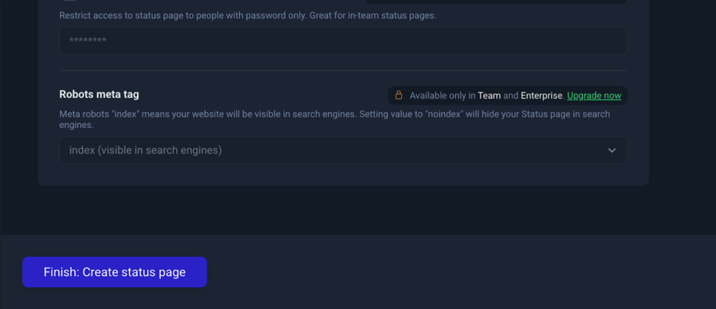
Figure 30: Finish creating your status page
- Customize your status page appearance
UptimeRobot lets you customize several aspects of your status page directly from the Appearance tab.
You can configure:
- Layout position (logo on the left or centered)
- Light or dark theme
- Normal or compact density
- Logo and favicon
- Header background color
- Header text color
- Link color
- Font family
These settings make it easy to align your status page with your brand without modifying code or maintaining a separate design system. page stay visually consistent with your main website while keeping UptimeRobot’s structure clean and reliable.
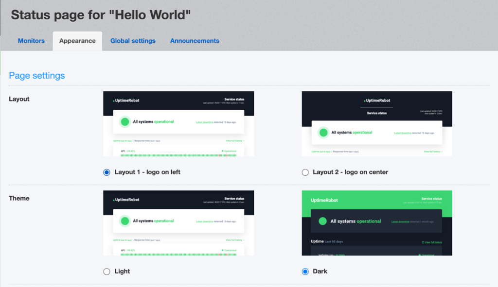
Figure 31: Change the appearance of your status page
You can also control which information appears on your status page.
Available options include:
- Displaying uptime bar charts
- Showing uptime percentages
- Enabling the floating status bar
- Showing overall uptime percentages
- Displaying outage updates and recent downtime
- Enabling the details page
- Showing monitor URLs
- Hiding paused monitors
Choose the options that best match the level of transparency and detail you want to provide to visitors.
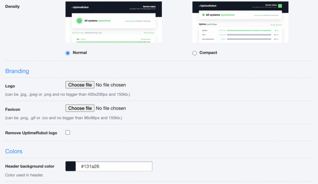
Figure 32: Adjust colors and branding elements to match your brand palette
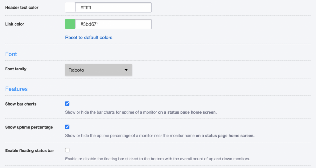
Figure 33: Modify typography, spacing, or layout details
Figure 34: Add advanced customization features
Status Page Pro Kit
We have designed these free downloadable PDFs to help you create a professional status page quickly and with ease.
What’s inside?
The Status Page Pro Kit includes:
- Setup checklist: A step-by-step list covering essentials like component setup, communication tone, and visibility settings.
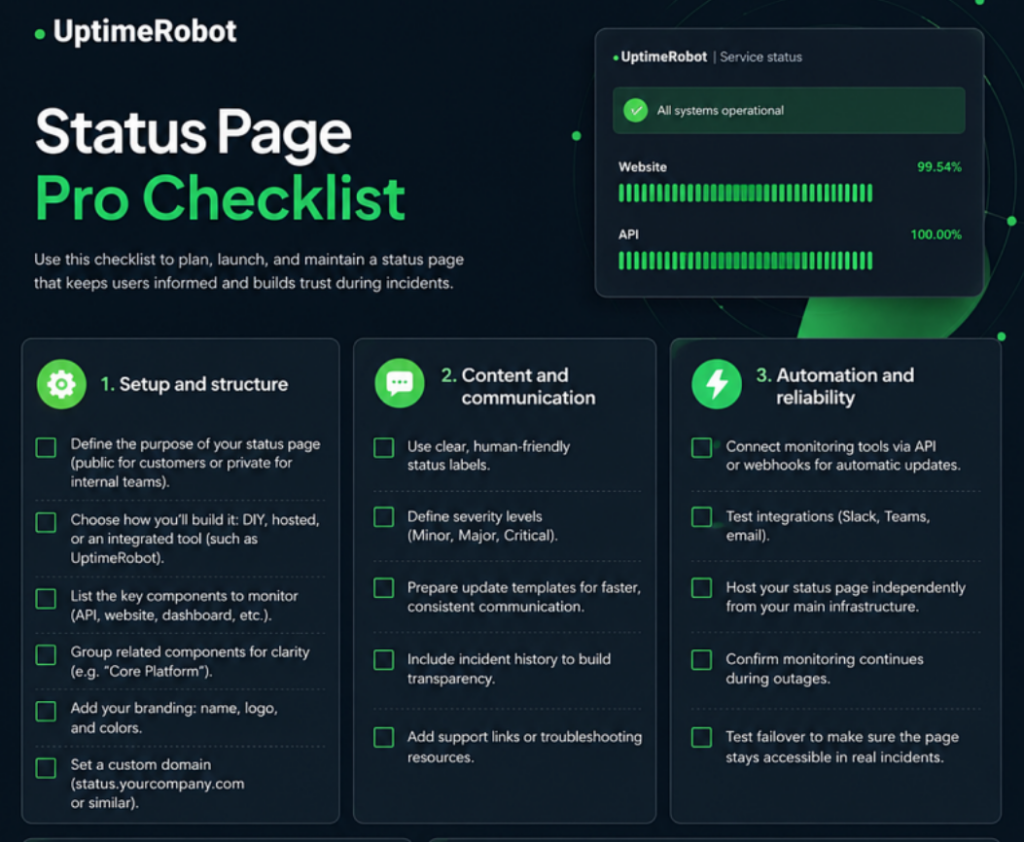
Figure 35: Status page setup checklist
- Style guide: Simple color and typography suggestions to maintain clarity and readability.
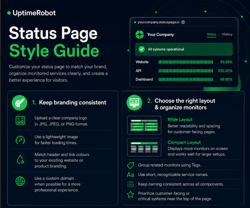
Figure 36: Status page style guide
- Incident communication copy snippets: Pre-written, editable messages for different incident stages (identified, investigating, resolved).
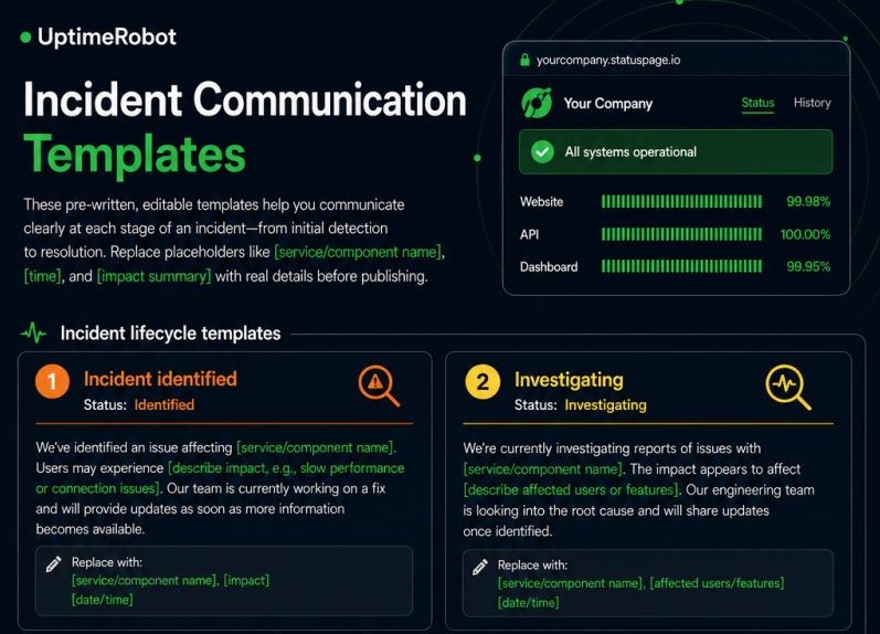
Figure 37: Incident communication copy snippets
These ready-to-use resources will ensure your first version looks professional, communicates clearly, and aligns with best practices.
Example scenarios: SaaS startup vs internal IT team
For a SaaS startup
Your users are external customers, so transparency and clarity are essential. Keep your status page public and use plain, friendly language that’s easy to understand. Include uptime metrics, component statuses, and recent incident summaries. Automate updates using webhooks so users always see the latest information in real time.
For an internal IT team
Your audience is your employees or internal stakeholders. A private or password-protected status page works best here. Since the readers are more technical, you can use technical terms and system-specific jargon. Focus on clarity, detailed impact areas, and quick updates about internal systems like VPN, file servers, or internal dashboards.
Maintenance and governance
A great status page needs care and consistency. Clear ownership, a simple update workflow, and regular testing keep it reliable when it matters most. Here are the key elements to manage your status page effectively.
Ownership and roles in incident communication
Imagine your API goes down on a busy Monday morning. Customers can’t log in, and alerts start firing. Without clear roles, everyone jumps into the same Slack channel. Engineers are debugging logs, support is pinging for updates, and marketing is asking what to tell customers. It’s chaos.
Nobody knows who’s writing the status page update, and ten minutes later, your users are already complaining about “radio silence.” Now, picture the same outage with roles defined:
- The Incident Commander takes charge, declares a SEV-1, and directs engineers to focus on isolating the faulty deployment.
- The Monitoring Engineer confirms which endpoints are failing and feeds data to the IC.
- The Communications Lead posts an initial update on the status page: “We’re investigating elevated API errors.”
- The Support Lead uses a templated message to reply to customer tickets.
- The Stakeholder Notifier informs leadership that customer login failures affect 30% of sessions.
Within minutes, the response is coordinated, updates are timely, and customers see transparency instead of silence. That’s why you don’t leave communication to chance. Assign clear roles so everyone knows what to do when things break.
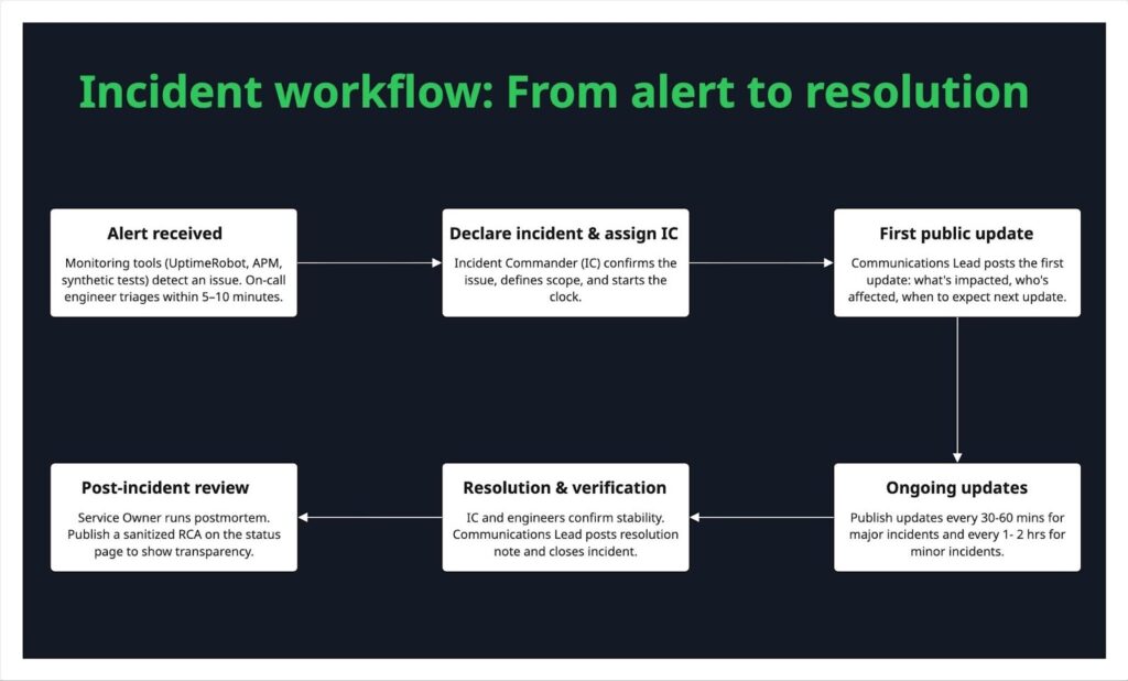
Workflow from alert → status update → resolution
A well-rehearsed workflow turns chaos into clarity when incidents strike. Here’s how it typically unfolds:
It starts with an alert. Monitoring tools like UptimeRobot or APM systems flag a potential issue. Within minutes, the on-call engineer triages it, confirming if it’s real or a false alarm.
If confirmed, the Incident Commander (IC) declares an incident, recording its start time and scope. The Communications Lead quickly posts the first public update (usually within 10–15 minutes): what’s affected, who’s impacted, and when to expect the next update.
As the team investigates and mitigates, ongoing updates keep rolling out, every 30–60 minutes for major issues, or hourly for smaller ones. Transparency matters more than perfection; even a “no ETA yet” keeps users informed.
When the issue is fixed, the IC and engineers verify stability before marking it resolved. The Communications Lead posts a clear resolution note and summary of the fix.
Finally, the post-incident phase begins. The IC officially closes the incident, while the Service Owner leads a postmortem within 48–72 hours. Once complete, a public RCA is shared on the status page to show accountability and learning.
This flow should live in your incident runbook, and wherever possible, automate it. Webhooks can trigger draft updates, and Slack alerts can assign ICs instantly. The smoother the workflow, the faster you regain trust.
Running drills and testing the page
Treat your status page like emergency lighting. It should always work when needed. Test it regularly to ensure it’s visible, reliable, and ready when real incidents occur.
Quarterly tabletop drills
Simulate an outage with your Incident Commander, Communications Lead, and Support team. Walk through declaring an incident, posting updates, and escalating issues.
Biannual live simulations
Run a safe “mock outage” using a non-production monitor or planned maintenance. Check that automation, notifications, and integrations work end-to-end. Mark it clearly as a drill on your status page.
Pre-release checks
Before deploying changes to templates, subscriber settings, or webhooks, run a quick smoke test.
Accessibility & mobile QA
Make sure everyone can read your updates. Test keyboard navigation, screen readers, and mobile layouts at least once per release.
Post-incident reviews
After every real incident, ask:
- Was the status page used correctly?
- Were updates timely and clear?
Document what you learn and update your playbook. Make these drills a regular, measurable part of on-call performance. That’s how reliability becomes muscle memory.
Metrics to track: visitors, subscribers, ticket reduction
Track key metrics to understand how well it’s serving users and your team.
Visitors
Monitor how many people view your status page during incidents and normal periods. Spikes during outages can help validate communication timing and reach. Low engagement might mean users don’t know where to find it.
Subscribers
Track growth and retention of email or SMS subscribers. A healthy subscription rate shows users trust your page for timely updates. Declining numbers could signal notification fatigue or irrelevant alerts.
Ticket reduction
Measure the number of support tickets or chat inquiries during incidents. A well-maintained status page should reduce “Is it just me?” messages. Compare ticket volumes before and after major updates to gauge effectiveness.
Common pitfalls to avoid
Even well-designed status pages can be confusing if they’re not managed properly. Here are some of the most common mistakes teams make and how you can avoid them.
Status page downtime itself
A status page that fails during an outage breaks user trust instantly. Always host it separately from your main infrastructure (different domain or provider). If your core services run on AWS, place your status page on a neutral platform or CDN to ensure it stays reachable.
Tools like UptimeRobot’s hosted status pages are purpose-built for this. Test your failover occasionally to confirm that your “always-on” page truly lives up to its promise.
Silence or late updates during incidents
Like we discussed earlier, the worst thing you can do during an outage is go silent. Even if you don’t have all the answers yet, share an update within 15 minutes of confirming the issue. A simple “We’re aware and investigating” is better than no message at all. Be transparent with your users; they deserve it.
Set a clear update rhythm for each severity level, like every 30 minutes for major incidents, and use simple templates to make timely communication second nature.
Overly technical jargon
Your users don’t need to hear about database replication lag or Nginx upstream timeouts. They just want to know what’s affected and when it’ll be fixed. Keep your updates plain, empathetic, and focused on the outcome.
Example:
❌ “Primary Redis shard connection timeout due to IOPS saturation.”
✅ “Some users may experience slower responses. We’re investigating a performance issue in our caching system.”
Write as if you’re explaining the issue to a non-technical teammate.
Spammy notifications
Over-communicating can be just as frustrating as going silent. Constant pings, duplicate emails, or low-value alerts quickly cause alert fatigue and make users unsubscribe.
Combine smaller updates into summaries, use clear severity levels, and let users choose how often and what they want to be notified about.
Outdated or misleading status info
Nothing breaks trust faster than seeing “All systems operational” when users know something’s wrong. If your monitoring or internal alerts flag an issue, your status page should show it right away.
Automate updates where possible using tools like the UptimeRobot API, and make someone responsible for reviewing all components weekly. If you post updates manually, set reminders to close resolved incidents quickly so your page always reflects reality.
Conclusion & next steps
A great status page builds trust between you and your customers. Transparency is the foundation of that trust. Keep your communication clear, your updates consistent, and your layout simple.
Let’s quickly recap the key best practices and templates discussed in this guide:
- Keep your status page design simple, accurate, and human.
- Communicate early and provide regular updates during incidents.
- Use clear status indicators and define what each state means.
- Make incident history accessible for transparency.
- Align your page visually with your brand while prioritizing clarity.
If you’re looking for an easy, no-code way to set up a great-looking status page, try UptimeRobot. It lets you create, customize, and automate your status updates in minutes. And, don’t forget to download your Status Page Pro Kit to make setup even easier.
-
A status page is a public or private web page that shows the real-time health of your services, APIs, or systems. It helps users know whether everything’s working or if there’s an ongoing incident.
-
Companies need a status page to build trust with their users. A status page keeps users informed about outages or maintenance in real time, showing that your team is transparent and in control. It also reduces the number of support tickets and helps maintain credibility even during downtime.
-
A public status page is visible to your users or customers and keeps them informed about outages, uptime, and maintenance. A private status page, on the other hand, is used internally by teams to monitor systems, coordinate responses, and manage incidents without sharing details publicly.
-
A status page gives an overall view of your system’s health and uptime across all components. An incident page focuses on a single ongoing issue, providing detailed updates, timelines, and resolutions for that specific event.
-
You can either build one yourself using HTML and API integrations or use a platform like UptimeRobot, which helps you set up a professional, hosted status page in just a few minutes, no coding required.
-
A status page should include:
– Current service statuses
– Incident timeline and updates
– Historical uptime data
– Subscription options for notifications
– Clear contact or support links -
Keep your status page simple, accurate, and easy to understand. Communicate early, use clear language (not jargon), post regular updates during incidents, and archive resolved issues to maintain transparency and build long-term trust.
-
Aim to update every 15-30 minutes, even if there’s no major progress. A simple “We’re still investigating and will share the next update soon” keeps users informed and reassured. Silence causes more frustration than the outage itself.
-
Yes, absolutely. Even if you’re a one-person team, a status page helps you communicate transparently, reduce support noise, and build trust with early users. It shows reliability and professionalism right from day one.
-
Focus on metrics your users actually care about, like uptime percentage, response time, and recent incident history. Skip internal or overly technical data that doesn’t help users understand service health at a glance.
-
A clear, regularly updated status page helps users help themselves. When people can see there’s an ongoing issue, they’re less likely to contact support. This simple transparency can cut ticket volume by 20 to 40 per cent during incidents.
-
Some of the biggest pitfalls include:
– Letting your status page go down during an outage
– Showing outdated or incorrect statuses
– Sending too many notifications
– Delaying or skipping updates
– Using technical jargon